
Knowing when to Respond - Mobile Design Strategy Case Study
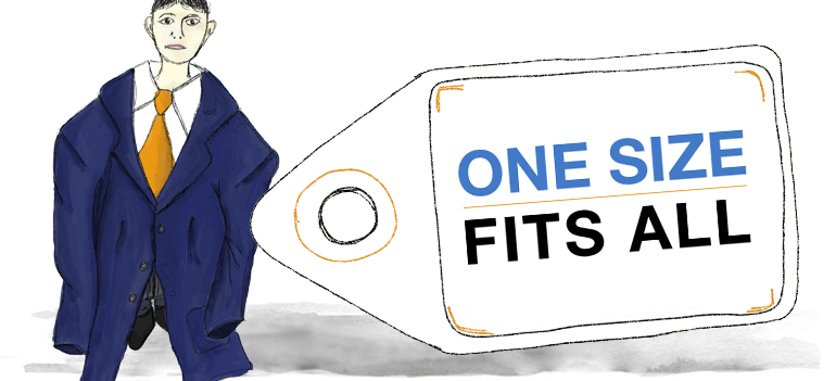
I'm an advocate of Responsive Web Design, in the ever changing way we access the web it's a progressive step in designing for various screen sizes and resolutions. However of late I've seen trends that would suggest Responsive Web is the single and only solution for delivering a Mobile Strategy.
"Responsive Design is not a panacea. Rather a great step in the right direction" - Brad Frost.
There is also the notion that Mobile First is a costly and time consuming approach to adopt. This somewhat misses the point; maybe it's just a miss-interpretation of what Luke Wroblewski's Mobile First actually means! Mobile First shouldn't always involve starting from scratch for existing websites, nor is it merely about designing for small screens and adding more features for larger screens.
To the User Experience Designer 'Mobile First' is about designing experiences that meet user needs through the Context and Power of Mobile, harnessing the 'Smartphones' full capabilities and realising designs that breakaway from the limitations of the desktop computer.
When laying out a Mobile Strategy we have a wide range of methods and approaches in our mobile design kitbag:
- Native Apps
- Mobile Web Apps
- Hybrid-Apps
- Adaptive Web
- Responsive Web
The most important point is these shouldn't be seen as competing, but instead a Mobile Design Strategy can be made up of any number of approaches. The key to success however is that together they deliver a consistent and seamless experience for the end user.
Enough preamble; here's a 'real world' example of how a tailored mobile experience was realised through multiple approaches:
Read moreThe Magic of Transitions and Animation in Mobile Interaction Design

This is a continuation from my previous article - Mobile Interaction Design for the subconscious mind, where we looked at how Interaction Design and Animation can help form mental models for mobile touch-screen navigation.
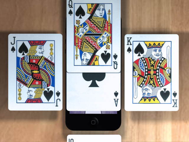
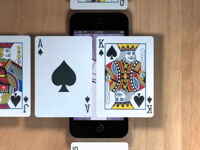
The Magician shuffles the deck of cards. "Pick a card, and place it back into the pack", he says. As the deck is reshuffled the chosen card's location is traced as it transcends through the pack, sliding over and under each card in turn.
"It’s the quickness of the hand that deceives the eye," the Magician says, as he flips the card over to reveal the Ace of Spades.
The playing card analogy works well when Designing Mobile Interactions.
Take half a dozen cards and place them on top of each other, now think of how touch gestures can be used to explore the cards, and how various techniques should be used to present information.
In the video below we use a number of playing cards to help visualise the importance of animation in Mobile App Design
Slide Over
Method: Using either a tap or swipe gesture to slide a new screen above the one currently in view.
Use: Often used to display a modal dialogue, interrupting the users current flow.
Real example: Selecting the 'Sign in' link on Google's Mobile App will slide over a 'Sign In' screen - Slide Over Example
Slide left/right
Method: Using the swipe gesture to slide left and right
Use: To navigate back and forth through a sequence of screens
Read moreMobile Usability Testing
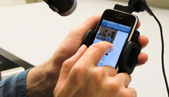
Conducting usability tests for Mobile Websites and Applications can be tricky without the appropriate equipment. Recently I sat in on some observations for a new Mobile App, all-in-all it went really well, but I couldn't help but think the equipment could have been better. There were restrictions applied to the candidates, where they were unable to move the device from its observation cradle, this resulted in a reduction in natural movement and behaviour.
Jan Evans of Fusion Alliance has written a summary of Setup options for Mobile Usability Testing, the article looks at a variety of usability test equipment for Mobile devices and includes the Pros and Cons of each - these range from Wearable, Screen Capture applications, Document Cameras, Specific mounts/testing sleds and Do It Yourself solutions.
Read moreFine tuning the mobile touchscreen keyboard
There are some really good articles on the usability of Touchscreen keyboards, some comparing Android to iOS, others look at variations between manufactures. This article summarises the results from a short usability study. Using eye tracking and predictive techniques it helps revealed why some touch keyboards are easier to use than others.
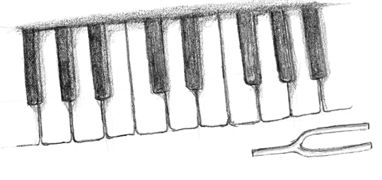
A crescendo reverberates around the auditorium as the piano keys are struck with measured precision and vigour. The pianist barely has to even glance at the piano's keys as each delivers a tactile and audible response to the senses.
Read moreMobile Interaction Design for the subconscious mind
This article looks at how our perception of the physical world can be harnessed to design effective and successful Interaction patterns for Mobile touch screens.
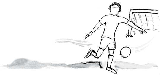
The football zooms across field at great speed. As you attempt to volley it goal-ward your conscious mind is rapidly deciding upon the best approach to score; as you watch the trajectory and predict the ball's location your unconscious is preparing your muscles for impact. GOAL! Like everything we do this entire process occurs at a conscious and subconscious level, as we interact with the physical world in which we live.
Read morePrototyping Mobile Apps
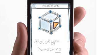
Creating a Mobile prototype is key to the success of any Mobile App, it helps us iterate our designs and qualify our approach through usability testing.
Things have moved on since the days of Visio and OmniGraffle, we now have a larger variety of tools at our disposal for Wireframing and designing web sites and applications. The likes of Axure, Balsamiq and others help demonstrate the rich interactive behaviour we expect to see in the end product.
When it comes to designing Mobile Apps it's so important to be able to demonstrate how the app will actually behave on the mobile device. We need to see how certain transitions and animations can be tailored to act as waypoints and help enrich the experience.
We've listed a number of useful tools that can be used effectively to prototype your Mobile Apps. These range from simple tools that allow a collection of images to be linked together via tap zones, to more complex applications that help you wireframe a design using a host of native app interfaces.
Read more