<?xml version="1.0" encoding="utf-8"?>
<feed xmlns="http://www.w3.org/2005/Atom">
   <title>Griffin Interactive</title>
   <link rel="alternate" type="text/html" href="http://www.griffininteractive.net/" />
   <link rel="self" type="application/atom+xml" href="http://www.griffininteractive.net/atom.xml" />
   <id>tag:www.griffininteractive.net,2014://1</id>
   <updated>2014-01-05T17:40:24Z</updated>
   <subtitle>The all new Griffin Interactive weblog</subtitle>
   <generator uri="http://www.sixapart.com/movabletype/">Movable Type 3.35</generator>

<entry>
   <title>Knowing when to Respond - Mobile Design Strategy Case Study</title>
   <link rel="alternate" type="text/html" href="http://www.griffininteractive.net/2014/01/knowing_when_to_respond_mobile_design_strategy_cas.html" />
   <id>tag:www.griffininteractive.net,2014://1.167</id>
   
   <published>2014-01-03T15:47:22Z</published>
   <updated>2014-01-05T17:40:24Z</updated>
   
   <summary> I&apos;m an advocate of Responsive Web Design, in the ever changing way we access the web it&apos;s a progressive step in designing for various screen sizes and resolutions. However of late I&apos;ve seen trends that would suggest Responsive Web...</summary>
   <author>
      <name>James Griffin</name>
      <uri>James</uri>
   </author>
         <category term="Mobile" scheme="http://www.sixapart.com/ns/types#category" />
   
   <category term="493" label="Adaptive Web" scheme="http://www.sixapart.com/ns/types#tag" />
   <category term="117" label="mobile" scheme="http://www.sixapart.com/ns/types#tag" />
   <category term="491" label="Mobile First" scheme="http://www.sixapart.com/ns/types#tag" />
   <category term="6" label="Mobile Web" scheme="http://www.sixapart.com/ns/types#tag" />
   <category term="432" label="Mobile Web Design" scheme="http://www.sixapart.com/ns/types#tag" />
   <category term="489" label="Responsive Web Design" scheme="http://www.sixapart.com/ns/types#tag" />
   
   <content type="html" xml:lang="en" xml:base="http://www.griffininteractive.net/">
      <![CDATA[<p><img src="http://www.griffininteractive.net/images/idesign/one-size-fits-all.png" alt="alt Picture of a boy wearing oversized clothes, with a message reading One Size Fits All - Transport visualiser"/></p>
<p>I'm an advocate of <strong>Responsive Web Design</strong>, in the ever changing way we access the web it's a progressive step in designing for various screen sizes and resolutions. However of late I've seen trends that would suggest Responsive Web is the single and only solution for delivering a Mobile Strategy.</p>

<blockquote>
<p>"Responsive Design is not a panacea. Rather a great step in the right direction" - Brad Frost.</p>
</blockquote>

<p>There is also the notion that <strong>Mobile First</strong> is a costly and time consuming approach to adopt. This somewhat misses the point; maybe it's just a miss-interpretation of what Luke Wroblewski's Mobile First actually means! Mobile First shouldn't always involve starting from scratch for existing websites, nor is it merely about designing for small screens and adding more features for larger screens.</p>

<p>To the User Experience Designer <strong>'Mobile First'</strong> is about designing experiences that meet user needs through the Context and Power of Mobile, harnessing the <strong>'Smartphones'</strong> full capabilities and realising designs that breakaway from the limitations of the desktop computer.</p>

<p>When laying out a Mobile Strategy we have a wide range of methods and approaches in our mobile design kitbag:</p>

<ul class="article">
<li>Native Apps</li>
<li>Mobile Web Apps</li>
<li>Hybrid-Apps</li>
<li>Adaptive Web</li>
<li>Responsive Web</li>
</ul>

<p>The most important point is these shouldn't be seen as competing, but instead a Mobile Design Strategy can be made up of any number of approaches. The key to success however is that together they deliver a consistent and seamless experience for the end user.</p>

<p>Enough preamble; here's a <em>'real world'</em> example of how a tailored mobile experience was realised through multiple approaches:</p>
]]>
      <![CDATA[<div class="hr" style="margin: -20px 0 40px 0"><hr></div>

<h2>GetAheadOFTheGames for Mobile</h2>

<p>Back in 2012 we were fortunate to work on the (<a href="http://bimaawards.com/2013-finalists.php#data">BIMA</a> nominated) <strong>GetAheadOfTheGames</strong> website, it was a website that helped travellers navigate and plan their daily journeys whilst the London 2012 Olympic Games were taking place. Nearing launch (and as expected) there was an influx of people accessing the site from their Smartphones. However there was no <em>'Mobile Friendly'</em> version. In real-world situations like this there is little time to recreate a responsive website, or for that matter to design and develop a new mobile version. For a complex site like this it would involve, effort in design, development and an entire cycle of testing.</p>
<p>So the brief was to create a Mobile friendly version of the site ASAP. The most effective and efficient approach was to use a strategy that involved Responsive Web, Adaptive Mobile Templates and creating a Mobile Web App for the core user journey - <em>public transport visualiser</em>.</p>

<div class="hr"><hr></div>
<h3>Responsive web</h3>
<p>We looked at which areas of the site could be made responsive with minimum effort, as the site was <strong>CMS</strong> driven through templates we identified which templates could be re-designed and modified.</p>
<p <p style="text-align: center"><img src="http://www.griffininteractive.net/images/idesign/GAOTG-Responsive.png" alt="alt GAOTG Responsive Template" title="" /></p>
<div class="hr"><hr></div>

<h3>Adaptive Mobile Web Template</h3>
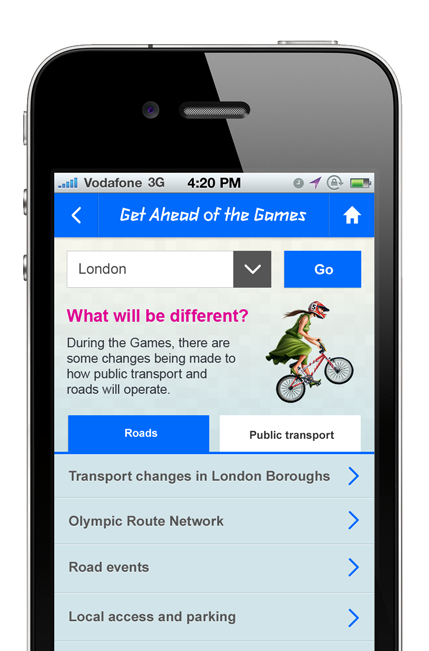
<p>Taking a step back and looking at the site from a Mobile first approach we identified key mobile user journeys - optimising the Information Architecture, content and navigation.</p>
<p style="text-align: center"><img style="text-align: center" src="http://www.griffininteractive.net/images/idesign/GAOTG-Adaptive.png" alt="alt GAOTG Mobile Web Template" title="" /></p>
<div class="hr"><hr></div>

<h3>Mobile Web App</h3>
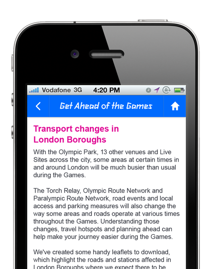
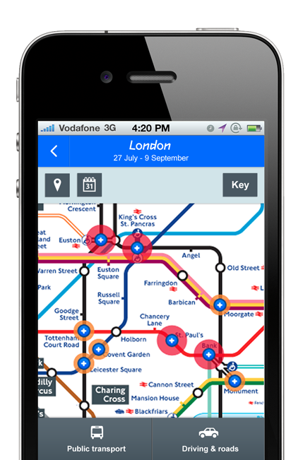
<p>The core intent of the site was to help people identify possible congestion in the transport system due to the Olympic games. A redesign involved improving the design for touch screen, small screen layout and making use of the devices location. Also designing this as a self-contained mobile web app meant users could easily save it to their home screen, and view travel information without having to access/navigate the entire mobile web site.</p>
<p style="text-align: center"><img style="text-align: center"src="http://www.griffininteractive.net/images/idesign/GAOTG-mobile-app.png" alt="alt Mobile Web App - Transport visualiser" /></p>

<h2>No one size fits all</h2>
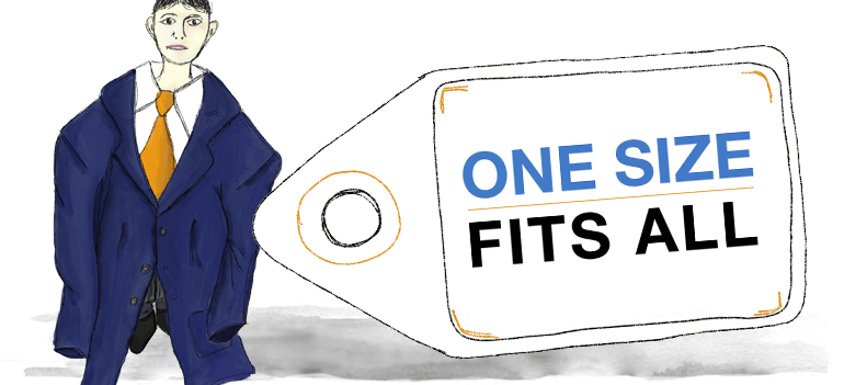
<p>In conclusion there is currently 'no one size fits all' approach when considering a Mobile Design Strategy, but instead we should look at which approaches can be used together to design and deliver the optimal User Experience, considering cost and time.</p>
<p>As yet using Responsive Web alone we won't be able to design solutions that utilise the full extent the Mobile device has to offer, therefore in this <em>real-world</em> case study we took the existing site and used Adaptive, Responsive Web and a Mobile Web App approach to deliver a very useful and award nominated Mobile experience.</p>

<dl>
<dt>Further reading:</dt>
<dd><a href="http://www.uxmatters.com/mt/archives/2012/03/mobile-first-what-does-it-mean.php" target="_BLANK">Mobile First: What Does It Mean?</dd>
<dd><a href="http://www.lukew.com/resources/mobile_first.asp" target="_BLANK">Mobile First</dd>
<dd><a href="http://alistapart.com/article/responsive-web-design/" target="_BLANK">Responsive Web Design</dd>
<dd><a href="http://en.wikipedia.org/wiki/Responsive_web_design"
target="_BLANK">What is Responsive Web Design?</dd>
<dd><a href="http://bradfrostweb.com/blog/post/the-many-faces-of-adaptive-design/"
target="_BLANK">The Many Faces of ‘Adaptive Design'</dd
<dd><a href="http://en.wikipedia.org/wiki/Adaptive_web_design"
target="_BLANK">What is Adaptive Web Design?</dd>
<dd><a href="http://visual.ly/adaptive-web-design-vs-responsive-web-design"
target="_BLANK">Adaptive Web Design vs. Responsive Web Design</dd>

</dl>]]>
   </content>
</entry>
<entry>
   <title>The Magic of Transitions and Animation in Mobile Interaction Design</title>
   <link rel="alternate" type="text/html" href="http://www.griffininteractive.net/2013/05/the_magic_of_transitions_and_animation_in_mobile_i.html" />
   <id>tag:www.griffininteractive.net,2013://1.165</id>
   
   <published>2013-05-11T15:13:24Z</published>
   <updated>2014-01-03T15:51:45Z</updated>
   
   <summary> This is a continuation from my previous article - Mobile Interaction Design for the subconscious mind, where we looked at how Interaction Design and Animation can help form mental models for mobile touch-screen navigation. The Magician shuffles the deck...</summary>


   <author>
      <name>James Griffin</name>
      <uri>James</uri>
   </author>
         <category term="Mobile" scheme="http://www.sixapart.com/ns/types#category" />
         <category term="UI Design Patterns" scheme="http://www.sixapart.com/ns/types#category" />
   
   <category term="486" label="Design Patterns" scheme="http://www.sixapart.com/ns/types#tag" />
   <category term="393" label="Mobile" scheme="http://www.sixapart.com/ns/types#tag" />
   <category term="487" label="Mobile Interaction" scheme="http://www.sixapart.com/ns/types#tag" />
   
   <content type="html" xml:lang="en" xml:base="http://www.griffininteractive.net/">
      <![CDATA[<p style="text-align: center"><img alt="Magicians hat and playing cards" src="http://www.griffininteractive.net/images/idesign/magicians-hat.jpg" /></p>

<p>This is a continuation from my previous article - <a href="http://www.griffininteractive.net/2012/10/mobile_interaction_design_for_the_subconscious_min.html">Mobile Interaction Design for the subconscious mind</a>, where we looked at how Interaction Design and Animation can help form <a href="http://en.wikipedia.org/wiki/Mental_models" target="_BLANK">mental models</a> for mobile touch-screen navigation.</p>

<div class="hr" style="margin: -20px 0 40px 0"><hr></div>

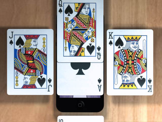
<p>The Magician shuffles the deck of cards. "Pick a card, and place it back into the pack", he says. As the deck is reshuffled the chosen card's location is traced as it transcends through the pack, <strong>sliding over</strong> and <strong>under</strong> each card in turn.</p>

<p>"It’s the quickness of the hand that deceives the eye," the Magician says, as he <strong>flips</strong> the card over to <strong>reveal</strong> the Ace of Spades.</p> 

<p>The playing card analogy works well when Designing Mobile Interactions.</p>
<p>Take half a dozen cards and place them on top of each other, now think of how touch gestures can be used to explore the cards, and how various techniques should be used to present information.</p>

<p>In the video below we use a number of playing cards to help visualise the importance of animation in Mobile App Design</p>

<div class="video-container">
<iframe class="youtube-player" type="text/html" width="640" height="480" src="http://www.youtube.com/embed/WI8svEf6bvg" allowfullscreen frameborder="0">
</iframe>
</div>

<div class="hr"><hr></div>

<h2>Slide Over</h2>

<p style="text-align: center"><img alt="Slide over" src="http://www.griffininteractive.net/images/idesign/PackOfCards_Slide-Over.jpg" /></p>

<p><strong>Method:</strong> Using either a tap or swipe gesture to slide a new screen above the one currently in view.</p>

<p><strong>Use:</strong> Often used to display a <a href="http://en.wikipedia.org/wiki/Modal_Dialog">modal dialogue</a>, interrupting the users current flow.</p>

<p><strong>Real example:</strong> Selecting the 'Sign in' link on Google's Mobile App will slide over a 'Sign In' screen - <a target="_BLANK" href="http://www.youtube.com/watch?v=Cis9lX5DKqI">Slide Over Example</a></p>

<div class="hr"><hr></div>

<h2>Slide left/right</h2>

<p style="text-align: center"><img alt="Slide right" src="http://www.griffininteractive.net/images/idesign/PackOfCards_Slide-Right.jpg" /></p>

<p><strong>Method:</strong> Using the swipe gesture to slide left and right</p>
<p><strong>Use:</strong> To navigate back and forth through a sequence of screens</p>]]>
      <![CDATA[<div class="hr"><hr></div>

<h2>Reveal</h2>

<p style="text-align: center"><img alt="Flipping playing card" src="http://www.griffininteractive.net/images/idesign/PackOfCards_Reveal.jpg" /></p>

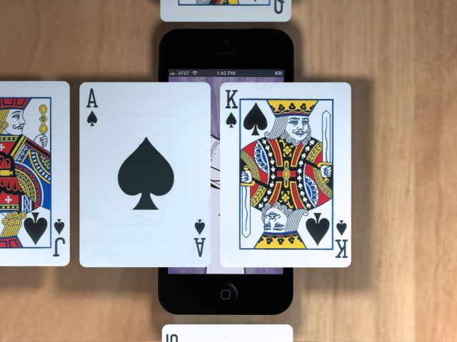
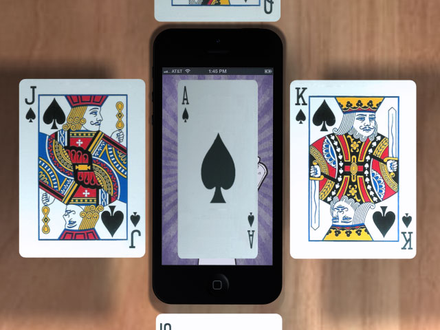
<p><strong>Method:</strong> Partially slide the screen in focus left or right to reveal a new screen underneath.</p>

<p><strong>Use:</strong> To reveal app navigation, or information that is in context to the overall application.</p>

<p><strong>Real example:</strong> An obvious example is the Facebook app or Path app, however here is an example that I 'Pinned' on my Pinterest board a while back <a target="_BLANK" href="http://pinterest.com/pin/213639576045258701/">Reveal Example</a></p>

<div class="hr"><hr></div>

<h2>Flip</h2>

<p style="text-align: center"><img alt="Flipping playing card" src="http://www.griffininteractive.net/images/idesign/PackOfCards_Flip.jpg" /></p>

<p><strong>Method:</strong> Tapping or double tapping on the current screen in view (side A) will flip the screen over to display the other side (side B).</p>

<p><strong>Use:</strong> Side B presents a more detailed view of information than that on side A, or displays settings that can be adjusted, effecting the information displayed on Side A.</p>

<p>I hope the playing card analogy helps demonstrate the subtle differences in animation and how we can use these techniques to form the basis of our Mobile Application Design.</p>

<dl>
<dt>Related articles</dt>
<dd><a href="http://www.uxbooth.com/articles/designing-for-mobile-part-2-interaction-design/" target="_BLANK">Designing for Mobile, Part 2: Interaction Design</dd>
<dd><a href="http://alistapart.com/column/better-navigation-through-proprioception" target="_BLANK">Better Navigation Through Proprioception</dd>
<dd><a href="http://uxdesign.smashingmagazine.com/2012/10/30/motion-animation-new-mobile-ux-design-material/" target="_BLANK">A New Mobile UX Design Material</dd>
<dd><a href="http://uxdesign.smashingmagazine.com/2012/02/28/mission-transition/" target="_BLANK">Mission Transition</dd>
</dl>
]]>
   </content>
</entry>
<entry>
   <title>Mobile Usability Testing</title>
   <link rel="alternate" type="text/html" href="http://www.griffininteractive.net/2012/12/mobile_usability_testing.html" />
   <id>tag:www.griffininteractive.net,2012://1.164</id>
   
   <published>2012-12-28T17:21:31Z</published>
   <updated>2013-09-28T12:08:50Z</updated>
   
   <summary> Conducting usability tests for Mobile Websites and Applications can be tricky without the appropriate equipment. Recently I sat in on some observations for a new Mobile App, all-in-all it went really well, but I couldn&apos;t help but think the...</summary>
   <author>
      <name>James Griffin</name>
      <uri>James</uri>
   </author>
         <category term="Mobile" scheme="http://www.sixapart.com/ns/types#category" />
         <category term="Usability" scheme="http://www.sixapart.com/ns/types#category" />
   
   <category term="482" label="Mobile Usability Testing" scheme="http://www.sixapart.com/ns/types#tag" />
   
   <content type="html" xml:lang="en" xml:base="http://www.griffininteractive.net/">
      <![CDATA[<img alt="mobile-usability-testing.jpg" src="http://www.griffininteractive.net/mobile-usability-testing.jpg" style="margin: 14px 0 8px 0; border: 1px solid #ccc; border-right: none"/>

<p>Conducting usability tests for Mobile Websites and Applications can be tricky without the appropriate equipment. Recently I sat in on some observations for a new Mobile App, all-in-all it went really well, but I couldn't help but think the equipment could have been better. There were restrictions applied to the candidates, where they were unable to move the device from its observation cradle, this resulted in a reduction in natural movement and behaviour.</p>

<p>Jan Evans of Fusion Alliance has written a summary of <a href="http://blog.fusionalliance.com/blog/digital-thoughts/options-for-mobile-usability-testing" target="_BLANK">Setup options for Mobile Usability Testing</a>, the article looks at a variety of usability test equipment for Mobile devices and includes the Pros and Cons of each - these range from Wearable, Screen Capture applications, Document Cameras, Specific mounts/testing sleds and Do It Yourself solutions.</p>]]>
      <![CDATA[<h2>Mobile Screen Capture Applications</h2>
<ul>
<li><a href="https://www.reflectorapp.com/" target="_BLANK">Reflector App</a> - Capture the screen of your iOS device and save it as a video file for later review</li>
<li><a href="http://www.foraker.com/our-work/ux-recorder/" target="_BLANK">UX Recorder</a> - Recording tool for usability professionals, Records both user actions (swipes, taps, scrolling) and video of the user via the device’s camera</li>
<li><a href="http://mouseflow.com/" target="_BLANK">Mouseflow</a> - Records videos of your site visitors and generates heatmaps, useful for Mobile Web Sites</li>
<li><a href="http://www.userlytics.com/sitepublic/" target="_BLANK">Userlytics.com</a> - A mobile app usability testing service (1 Free test per month)</li>
<li><a href="http://www.capturerecord.com/" target="_BLANK">CaptureRecord</a> - A useful way to capture the Mobile Screen within your iOS Mobile app (Software Developer API)</li>
</ul>

<h2>Do-it-Yourself Mobile Usability Testing</h2>
<ul>
<li><a href="http://www.90percentofeverything.com/2010/11/15/more-mobile-usability-testing-sleds/" target="_BLANK">DIY Usability testing sleds</a></li>
</ul>

<h2>Related articles</h2>
<ul>
<li><a href="http://www.diymobileusabilitytesting.net/diymut/2012/11/06/a-rather-serious-post-about-usability-testing-of-mobile-software/" target="_BLANK">A rather serious post about usability testing of mobile software</a></li>
<li><a href="http://www.diymobileusabilitytesting.net/diymut/conferences/south-by-south-west-2012/" target="_BLANK">SXSW 2012 DIY Mobile Usability Testing</a></li>
<li><a href="/articles/UsabilityTestingForMobile.pdf" target="_BLANK">Usability Testing for Mobile Scenarios of Fragmented Attention </a> - Research paper (PDF)</li>
<li><a href="http://johnnyholland.org/2012/01/10-tips-for-mobile-usability-testing/" target="_BLANK">10 Tips for Mobile Usability Testing</a></li>
<li><a href="http://www.optimalusability.com/2012/01/10-tips-for-mobile-usability-testing/" target="_BLANK">Another 10 Tips for Mobile Usability Testing</a></li>
<li><a href="http://uxmag.com/articles/mobile-testing-toolbox-part-1" target="_BLANK">Mobile testing toolbox - Part 1 by Amber DeRosa</a>
</li>
<li><a href="http://news.bbc.co.uk/1/hi/programmes/click_online/9751991.stm" target="_BLANK">How Google fine tunes its search engine</a> - Insight into how Google use Mobile Usability testing to improve usability (Video)</li>
</ul>]]>
   </content>
</entry>
<entry>
   <title>Fine tuning the mobile touchscreen keyboard</title>
   <link rel="alternate" type="text/html" href="http://www.griffininteractive.net/2012/10/fine_tuning_the_mobile_touchscreen_keyboard.html" />
   <id>tag:www.griffininteractive.net,2012://1.163</id>
   
   <published>2012-10-13T12:38:49Z</published>
   <updated>2012-10-30T14:37:05Z</updated>
   
   <summary> There are some really good articles on the usability of Touchscreen keyboards, some comparing Android to iOS, others look at variations between manufactures. This article summarises the results from a short usability study. Using eye tracking and predictive techniques...</summary>
   <author>
      <name>James Griffin</name>
      <uri>James</uri>
   </author>
         <category term="Mobile" scheme="http://www.sixapart.com/ns/types#category" />
   
   <category term="478" label="Android" scheme="http://www.sixapart.com/ns/types#tag" />
   <category term="480" label="iOS" scheme="http://www.sixapart.com/ns/types#tag" />
   <category term="117" label="mobile" scheme="http://www.sixapart.com/ns/types#tag" />
   <category term="476" label="mobile interaction" scheme="http://www.sixapart.com/ns/types#tag" />
   <category term="323" label="touchscreen" scheme="http://www.sixapart.com/ns/types#tag" />
   
   <content type="html" xml:lang="en" xml:base="http://www.griffininteractive.net/">
      <![CDATA[ <img alt="piano sketch" src="http://www.griffininteractive.net/images/touch/piano-keys.png" />

<p>There are some really good articles on the <a href="http://www.griffininteractive.net/2012/10/fine_tuning_the_mobile_touchscreen_keyboard.html#touchscreen-research">usability of Touchscreen keyboards</a>, some comparing Android to iOS, others look at variations between manufactures. This article summarises the results from a short usability study. Using eye tracking and predictive techniques it helps revealed why some touch keyboards are easier to use than others.</p>

<p>A crescendo reverberates around the auditorium as the piano keys are struck with measured precision and vigour. The pianist barely has to even glance at the piano's keys as each delivers a tactile and audible response to the senses.</p>]]>
      <![CDATA[<h2>The touch screen keyboard</h2>

<p>Unlike the Piano keys, or physical keyboard the touchscreen delivers no tactile feedback. Therefore when typing, the user must concentrate and focus their attention on each and every key, ensuring that the correct one is pressed. This is far from ideal when typing, as we spend most of the time focusing on the keyboard and not on what we want to type. What exacerbates this task even further is that the finger tip covers the letter/touch-zone entirely.</p>

<h2>Touch zone</h2>

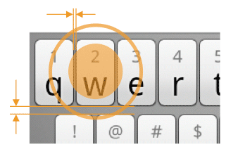
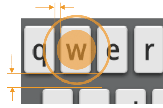
<p>It's clear to see that touch zone (finger size) and keyboard size make an obvious difference in the usability of the keyboard. The first example below shows the Touch-zone target encroaching into the neighbouring keys 'q' and 'e'. The spaces dividing the keys in example two make the target easier to hit.</p>

<ul class="ar">
<li><img alt="HTC Desire-Z Android Touchscreen Keyboard" style="" src="/images/touch/touch-zone.png" /></li>
<li><img alt="LG Optimus X2 Android Touchscreen Keyboard" style="" src="/images/touch/touch-zone1.png" /></li>
</ul>

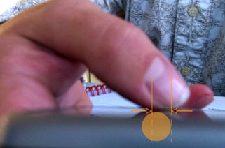
<p>Is it any wonder users often try to reduce their own touch-zone by using the corner of a finger tip.</p>

<ul class="ar">
<li><img alt="drag down" style="" src="/images/touch/touch-zone-finger.jpg" /></li>
</ul>

<p>Notably, iOS actually vary the touch target size depending upon which keys the user is most likely to press next (see research from <a href="http://pogue.blogs.nytimes.com/2007/06/27/iphone-keyboard-secrets/">David Pogue</a> and <a href="http://ignorethecode.net/blog/2009/08/07/virtual-keyboards-on-iphone-and-android/">Lukas Mathis</a>).</p>

<h2>Gaze Density</h2>

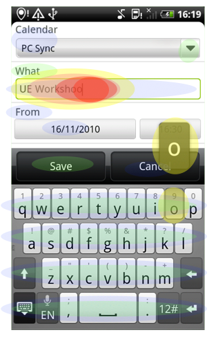
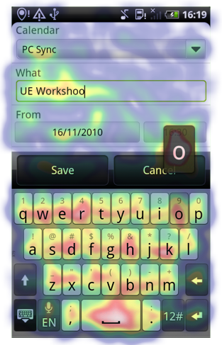
<p>To optimally perform the task of typing a users gaze density should be focused on the text field, or area, and not the touchscreen keyboard.</p>

<p>Comparing the ideal with the actual gaze density we can see the users focus is largely on the keyboard.</p>

<p style="text-align:center">Gaze density heat map key <br/> <img alt="" style="" src="/images/touch/gaze-density-heatmap-key.png" /></p>

<ul class="ar">
	<li><img alt="" style="" src="/images/touch/ideal-gaze-density.png" /</li>
	<li><img alt="" style="" src="/images/touch/actual-gaze-density.png" /></li>
</ul>

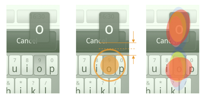
<p>The usability of the touchscreen keyboard is vastly improved by visually indicating which button has been pressed. However on many devices the indication is often presented at a large distance from the original button making feedback disjointed. This results in the users focus jumping back and forth between the finger (touch-zone) and the indicator.</p>

<ul class="ar">
	<li><img alt="" style="" src="/images/touch/gaze-density-comparison.png" /></li>
</ul>

<p>A far more effective pattern is to include a visual connection between the button and the feedback indicator.</p>

<ul class="ar">
	<li><img  src="/images/touch/gaze-density-comparison-2.png" /></li>
</ul>

<p>Using this approach ensures the gaze density is aligned with the key pressed giving immediate reassurance that the correct key has been selected.</p>
<p>Whilst testing we found this pattern to vastly improve both the speed and accuracy of touchscreen typing.</p>

<h2 id="touchscreen-research">Touchscreen Keyboard research and examples</h2>

<ul>
 <li><a href="http://nhenze.net/uploads/Observational-and-Experimental-Investigation-of-Typing-Behaviour-using-Virtual-Keyboards-on-Mobile-Devices.pdf">Observational and Experimental Investigation of Typing Behaviour using Virtual Keyboards on Mobile Devices</a></li>
 <li><a href="http://nhenze.net/?p=940">Large-scale analysis of mobile text entry</a></li>
 <li><a href="http://ignorethecode.net/blog/2009/08/07/virtual-keyboards-on-iphone-and-android/">Virtual Keyboards on iPhone and Android</a></li>
 <li><a href="http://pogue.blogs.nytimes.com/2007/06/27/iphone-keyboard-secrets/">iPhone Keyboard Secrets</a></li>
 <li>Various manufacturer examples</li>
 <li><a href="http://www.youtube.com/watch?v=g-zem9j6Jkc">Windows Phone 7 touchscreen keyboard video</a></li>
 <li><a href="http://www.youtube.com/watch?v=JEPYYo0-gfc">Blackberry 10 touchscreen keyboard</a></li>
</ul>]]>
   </content>
</entry>
<entry>
   <title>Mobile Interaction Design for the subconscious mind</title>
   <link rel="alternate" type="text/html" href="http://www.griffininteractive.net/2012/10/mobile_interaction_design_for_the_subconscious_min.html" />
   <id>tag:www.griffininteractive.net,2012://1.161</id>
   
   <published>2012-10-07T20:35:00Z</published>
   <updated>2013-02-10T12:33:41Z</updated>
   
   <summary> This article looks at how our perception of the physical world can be harnessed to design effective and successful Interaction patterns for Mobile touch screens. The football zooms across field at great speed. As you attempt to volley it...</summary>
   <author>
      <name>James Griffin</name>
      <uri>James</uri>
   </author>
         <category term="Mobile" scheme="http://www.sixapart.com/ns/types#category" />
         <category term="UI Design Patterns" scheme="http://www.sixapart.com/ns/types#category" />
   
   
   <content type="html" xml:lang="en" xml:base="http://www.griffininteractive.net/">
      <![CDATA[<img alt="Footballer strikes on goal" style="" src="http://www.griffininteractive.net/images/idesign/map-football.png" />

<p>This article looks at how our perception of the physical world can be harnessed to design effective and successful Interaction patterns for Mobile touch screens.</p>

<p>The football zooms across field at great speed. As you attempt to volley it goal-ward your conscious mind is rapidly deciding upon the best approach to score; as you watch the trajectory and predict the ball's location your unconscious is preparing your muscles for impact. GOAL! Like everything we do this entire process occurs at a conscious and subconscious level, as we interact with the physical world in which we live.</p>]]>
      <![CDATA[<h2>The digital world</h2>

<p>When designing web-sites we rely so heavily on informing only our conscious mind, through numerous labels, signposts and waypoints. As we view a website our eyes dart across the screen consuming the visual stimulus, dwelling on bright and attractive visuals like moths to a light. We pause to concentrate as we read and digest the instructions, pondering whilst we analyse what we see and do.</p>

<p>As web designers we are compelled to fill the large screen with content, just as an artist would paint on a huge canvas. However on a web-page more often than not this creates unnecessary complexity and cognitive load, which simply means you'll lose your reader or prospective customer.</p>

<h2>The Small Screen</h2>

<p>When designing for the small screen we are forced to focus on utilising the real-estate available, reducing content and signposts for navigation. This doesn't mean removing navigation entirely but instead thinking of ways we can inform the subconscious mind without the need for labels and textual description. Many successful Mobile design patterns achieve this by emulating everyday patterns in the physical world though our  understanding the Physics of motion.</p>

<h1>Replicating the real world though the physics of motion</h1>

<h2>Elasticity</h2>

<p>It was Newton who taught us about Inertia, where each action has an equal and opposite reaction. When you push or pull an object an equivalent force is applied. In Mobile design there are a number of affective patterns that use this understanding to help inform behaviour, namely the Pull-to-refresh, Recoil and Inertia Scroll.</p>

<h3>Pull-to-refresh content</h3>

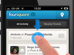
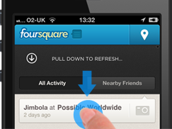
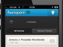
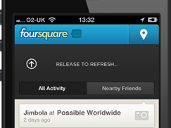
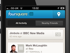
<p>The user drags or pulls on a list in order to update the content of that list.</p>

<style>
	ul.ar {
		display: block!important;
		width: 100%;
		text-align: center;
		margin: 20px 0;
	}
	ul.ar li {
		display: inline!important;
	}
	ul.ar li img {
		padding: 5px;	
	}
</style>

<ul class="ar">
<li><img alt="drag down" src="/images/idesign/drag-to-refresh-4SQ-1.png" /></li>
<li><img alt="drag down" src="/images/idesign/drag-to-refresh-4SQ-2.png" /></li>
<li><img alt="drag down" src="/images/idesign/drag-to-refresh-4SQ-3.png" /></li>
<li><img alt="drag down" src="/images/idesign/drag-to-refresh-4SQ-4.png" /></li>
<li><img alt="drag down" src="/images/idesign/drag-to-refresh-4SQ-5.png" /></li>
</ul>

<p>There is more to this pattern than pull down. It is the elasticity and motion that gives the user reassurance that something has happened, or about to happen. It is an affective pattern when observed in a usability test, and although it is learned behaviour, once discovered, users find themselves frequently using it to refresh content.</p>

<p>This pattern uses little real-estate and is useful in Mobile as loss of signal (internet connection) often requires users to refresh content to have an up-to-date view.</p>

<h3>Recoil to denote the Begin or End point</h3>

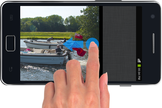
<p>This pattern is used to indicate the beginning and end of a sequence, it is often used when navigating an image gallery.</p>

<p>Once observed the user no-longer attempts to proceed, and instead subconsciously associates the last image (or first) viewed with this behaviour. I've tested the efficiency of this pattern on a number of occasions, it is so interesting to see how many times users attempt to continue when it is <u>not</u> used. Also when asking test candidates to recall their use of the gallery, very few recollect seeing the recoil or bounce effect. It is designing at this subconscious level that really makes a difference in interaction design.</p>

<quote>This technique enforces directional awareness which is 
beneficial for users when building a mental model of the start and end location within a sequence.</quote>

<img style="margin: 20px 0" alt="bounce effect" src="/images/idesign/recoil-end.png" />

<h2>Influencing gaze density through animation</h2>

<p>Another effective pattern in mobile design is the use of animation to help guide and draw attention to a particular area of the screen.</p>

<h3>Icon Grid</h3>

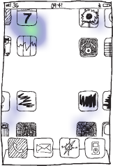
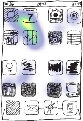
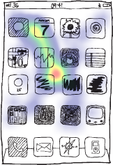
<p>The Grid, usually a set of evenly sized icons, this pattern serves the simple purpose of navigation (launching applications). Its optimum use is when restrained to only 4 x 4 icons, this is both for speed of use and location recollection.</p>

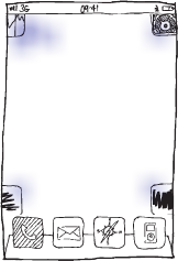
<p>In the western world it is common to read a grid of icons from top left, to bottom right, in a zig-zag motion. Although this process occurs at a fraction of a second it is still possible to increase recall and identification by applying a simple animation effect.</p>

<p>Apple have been using this technique since the first iPhone. The animation helps create a 'neutral' fixation point. This is where the eye line is drawn to the centre of the grid, momentarily stopping the viewer from 'reading' the grid. It is this process that causes the mind to view the grid in its entirety making it easier to locate the icon/application of choice.</p>

<ul class="ar">
<li><img alt="focus top left corner" src="/images/idesign/grid-sequence-1.png" /></li>
<li><img alt="focus follows the animation" src="/images/idesign/grid-sequence-2.png" /></li>
<li><img alt="focus nears center of the screen" src="/images/idesign/grid-sequence-3.png" /></li>
<li><img alt="focus is in the center" src="/images/idesign/grid-sequence-4.png" /></li>
</ul>

<p>Noteworthy, this animation is most effective on a small symmetrical grid of no more than 4x4 icons. The results also vary when the user becomes familiar and learns the location of the application icons within the grid.</p>

<p>When using animation to aid and inform interaction it is paramount that the execution is perfect, resembling exactly what we would expect from the physical world. A momentary judder or 'unnatural' motion and what should be registered at the subconscious is exactly the opposite, and instead causes annoyance and frustration. It is for this reason that animations (transition effects) should only be used with devices that are capable of presenting the desired result.</p>

<h2>Applying the correct interaction</h2>

<p>It's so important not to blindly copy an approach but gain a full understanding of why and how it is used. I've seen a number of mobile manufacturers use mobile interaction patterns incorrectly, be it through how they've been applied or context of use (Pinch-to-zoom gesture being used to navigate content!).</p>

<p>Focus on designing interactions at a subconscious level, where success is measure by the fact that the user doesn't even notice they are there.</p>

<h2>Related links</h2>
<ul>
<li><a href="http://tympanus.net/codrops/2013/02/08/designing-with-motion/" target="_BLANK">Designing with motion</a> - a collection of exemplar videos demonstrating the subtle use of animation and motion within interface design </li>
<li><a href="http://uxdesign.smashingmagazine.com/2012/10/30/motion-animation-new-mobile-ux-design-material/" target="_BLANK">A New Mobile UX Design Material</a> - exploration of how animation can be used to improve interaction and interface design </li>
</ul>]]>
   </content>
</entry>
<entry>
   <title>Prototyping Mobile Apps</title>
   <link rel="alternate" type="text/html" href="http://www.griffininteractive.net/2012/07/prototyping_mobile_apps.html" />
   <id>tag:www.griffininteractive.net,2012://1.160</id>
   
   <published>2012-07-15T00:31:29Z</published>
   <updated>2014-04-02T16:23:27Z</updated>
   
   <summary> Creating a Mobile prototype is key to the success of any Mobile App, it helps us iterate our designs and qualify our approach through usability testing. Things have moved on since the days of Visio and OmniGraffle, we now...</summary>
   <author>
      <name>James Griffin</name>
      <uri>James</uri>
   </author>
         <category term="Mobile" scheme="http://www.sixapart.com/ns/types#category" />
   
   <category term="393" label="Mobile" scheme="http://www.sixapart.com/ns/types#tag" />
   <category term="6" label="Mobile Web" scheme="http://www.sixapart.com/ns/types#tag" />
   <category term="193" label="Prototype" scheme="http://www.sixapart.com/ns/types#tag" />
   
   <content type="html" xml:lang="en" xml:base="http://www.griffininteractive.net/">
      <![CDATA[<img alt="Mobile Prototyping" src="http://www.griffininteractive.net/images/proto/prototypeso.png" width="337" style="margin: 14px 0 8px 0; border: 1px solid #ccc; border-right: none"/>

<p>Creating a Mobile prototype is key to the success of any Mobile App, it helps us iterate our designs and qualify our approach through usability testing.</p>

<p>Things have moved on since the days of Visio and OmniGraffle, we now have a larger variety of tools at our disposal for Wireframing and designing web sites and applications. The likes of Axure, Balsamiq and others help demonstrate the rich interactive behaviour we expect to see in the end product.</p>

<p>When it comes to designing Mobile Apps it's so important to be able to demonstrate how the app will actually behave on the mobile device. We need to see how certain transitions and animations can be tailored to act as waypoints and help enrich the experience.</p>

<p>We've listed a number of useful tools that can be used effectively to prototype your Mobile Apps. These range from simple tools that allow a collection of images to be linked together via tap zones, to more complex applications that help you wireframe a design using a host of native app interfaces.</p>

]]>
      <![CDATA[<a href="http://www.appcooker.com"><img alt="AppCooker" src="http://www.griffininteractive.net/images/proto/appcooker.png" width="337" style="margin: 14px 0 8px 0; border: 1px solid #ccc"/></a>
<h2><a name="appcooker" href="http://www.appcooker.com">App Cooker</a></h2>
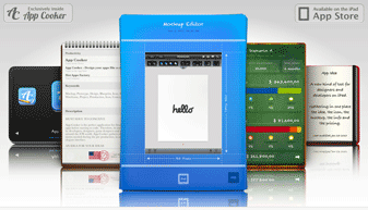
<p>An iPad app for prototyping iOS apps, this app is a kitbag of tools, From capturing your apps definition statement, Icon creation guides, mock-up creation tools, Price guidance and an App Store submission checklist.</p>
<ul>
<li><b>Prototyping:</b> iOS Apps</li>
<li><b>Create:</b> iPad</li>
<li><b>View:</b> iPad</li>
<li><b>Share:</b> No</li>
<li><b>Private share:</b> No</li>
<li><b>Capture feedback/comments:</b> No</li>
<li><b>Widget library:</b> Yes</li>
<li><b>Simulate transitions:</b> No</li>
<li><b>Hosted service:</b> No</li>
<li><b>Price:</b> £17.99</li>
</ul>

<div class="hr"><hr></div>

<a href="http://www.appinseconds.com/"><img alt="App in Seconds" src="http://www.griffininteractive.net/images/proto/appinseconds.png" width="337" style="margin: 14px 0 8px 0; border: 1px solid #ccc"/></a>
<h2><a name="appinseconds" href="http://www.appinseconds.com/"> App in Seconds</a></h2>
<p>Create a simple tap-through from your uploaded images, linking via hotspots</p>
<ul>
<li><b>Prototyping:</b> Mobile Apps</li>
<li><b>Create:</b>Via Web interface</li>
<li><b>View:</b> Mobile Web</li>
<li><b>Share:</b> Yes (via email link)</li>
<li><b>Private share:</b> No</li>
<li><b>Capture feedback/comments:</b> No</li>
<li><b>Widget library:</b> No</li>
<li><b>Simulate transitions:</b> Yes</li>
<li><b>Hosted service:</b> Yes</li>
<li><b>Price:</b> £6.99/Month</li>
</ul>

<div class="hr"><hr></div>

<a href="http://www.axure.com"><img alt="Axure" src="http://www.griffininteractive.net/images/proto/axure.png" width="337" style="margin: 14px 0 8px 0; border: 1px solid #ccc"/></a>
<h2><a name="axsure" href="http://www.axure.com">Axure</a></h2>
<p>Present your wireframes via AxShare - <a href="http://www.axure.com/mobile-website-tutorial">Mobile Website Tutorial</a></p>
<ul>
<li><b>Prototyping:</b> Mobile Apps</li>
<li><b>Create:</b> Windows or Mac</li>
<li><b>View:</b> AxShare</li>
<li><b>Share:</b> Yes (Via AxShare)</li>
<li><b>Private share:</b> Yes</li>
<li><b>Capture feedback/comments:</b> No</li>
<li><b>Widget library:</b> Yes</li>
<li><b>Simulate transitions:</b> Yes</li>
<li><b>Hosted service:</b> No</li>
<li><b>Price:</b> £379</li>
</ul>


<div class="hr"><hr></div>
<a href="http://giveabrief.com/"><img alt="giveabrief" src="http://www.griffininteractive.net/images/proto/briefs.png" width="337" style="margin: 14px 0 8px 0; border: 1px solid #ccc"/></a>
<h2><a name="giveabrief" href="http://www.groosoft.com/blueprint/">Briefs</a></h2>
<p></p>
<ul>
<li><b>Prototyping:</b> iOS Apps</li>
<li><b>Create:</b> Via Mac App</li>
<li><b>View:</b> App</li>
<li><b>Share:</b> Yes via Briefs player app</li>
<li><b>Private share:</b> No</li>
<li><b>Capture feedback/comments:</b> No</li>
<li><b>Widget library:</b> Yes</li>
<li><b>Simulate transitions:</b> Yes - Uses real native transitions</li>
<li><b>Hosted service:</b> No</li>
<li><b>Price:</b>  $199 (One off app purchase)</li>
</ul>

<div class="hr"><hr></div>
<a href="http://www.groosoft.com/blueprint/"><img alt="Blueprint" src="http://www.griffininteractive.net/images/proto/blueprint.png" width="337" style="margin: 14px 0 8px 0; border: 1px solid #ccc"/></a>
<h2><a name="blueprint" href="http://www.groosoft.com/blueprint/">Blueprint</a></h2>
<p></p>
<ul>
<li><b>Prototyping:</b> iOS Apps</li>
<li><b>Create:</b> iPad</li>
<li><b>View:</b> iOS Blueprint viewer</li>
<li><b>Share:</b> Yes (Via DropBox)</li>
<li><b>Private share:</b> Yes</li>
<li><b>Capture feedback/comments:</b> No</li>
<li><b>Widget library:</b> Yes</li>
<li><b>Simulate transitions:</b> Yes</li>
<li><b>Hosted service:</b> No</li>
<li><b>Price:</b> £17.99</li>
</ul>

<div class="hr"><hr></div>
<a href="http://codiqa.com"><img alt="Codiqa" src="http://www.griffininteractive.net/images/proto/codiqa.png" width="337" style="margin: 14px 0 8px 0; border: 1px solid #ccc"/></a>
<h2><a name="codiqa" href="http://codiqa.com">Codiqa</a></h2>
<p>This Web app allows you to actually produce the Mobile Web App through a range of pre-designed UI Widgets.</p>
<ul>
<li><b>Prototyping:</b> Mobile Web Apps (Actual app)</li>
<li><b>Create:</b> Via web interface</li>
<li><b>View:</b> iOS Blueprint viewer</li>
<li><b>Share:</b> Yes (via invitation list)</li>
<li><b>Private share:</b> Yes</li>
<li><b>Capture feedback/comments:</b> No</li>
<li><b>Widget library:</b> Yes</li>
<li><b>Simulate transitions:</b> Yes</li>
<li><b>Hosted service:</b> Yes</li>
<li><b>Price:</b> A range of tiered price plans including a 1 Free Project (10MB only)</li>
</ul>


<div class="hr"><hr></div>
<a href="http://dapp.kerofrog.com.au/"><img alt="Dapp" src="http://www.griffininteractive.net/images/proto/dapp.png" width="337" style="margin: 14px 0 8px 0; border: 1px solid #ccc"/></a>
<h2><a name="dapp" href="http://dapp.kerofrog.com.au/">Dapp</a></h2>
<p>Create mock-ups, generate pdf wireframes and actually export a skeleton Xcode project to start developing from.</p>
<ul>
<li><b>Prototyping:</b> iPhone Apps</li>
<li><b>Create:</b> iPad/iPhone</li>
<li><b>View:</b> iPad/iPhone</li>
<li><b>Share:</b> Yes (via emailed PDF)</li>
<li><b>Private share:</b> No</li>
<li><b>Capture feedback/comments:</b> No</li>
<li><b>Widget library:</b> Yes</li>
<li><b>Simulate transitions:</b> Yes</li>
<li><b>Hosted service:</b> Yes</li>
<li><b>Price:</b> £6.99 or free lite version</li>
</ul>

<div class="hr"><hr></div>
<a href="http://fieldtestapp.com"><img alt="fieldtestapp" src="http://www.griffininteractive.net/images/proto/fieldtest.png" width="337" style="margin: 14px 0 8px 0; border: 1px solid #ccc"/></a>
<h2><a name="fieldtestapp" href="http://fieldtestapp.com">Field Test App</a></h2>

<p></p>

<div class="hr"><hr></div>
<a href="http://www.flinto.com/"><img alt="flinto" src="http://www.griffininteractive.net/images/proto/flinto.png" width="337" style="margin: 14px 0 8px 0; border: 1px solid #ccc"/></a>
<h2><a name="flinto" href="http://www.flinto.com/editor">Flinto</a></h2>
<p>Flinto strikes the perfect balance between fast prototyping and realism.
Prototypes run on iPhone or iPad and can be shared with anyone.</p>
<ul>
<li><b>Prototyping:</b> iPhone Apps</li>
<li><b>Share:</b> Yes</li>
<li><b>Private share:</b> Yes</li>
<li><b>Capture feedback/comments:</b> No</li>
<li><b>Widget library:</b> No - You use your own sketches/images</li>
<li><b>Simulate transitions:</b> Yes</li>
<li><b>Hosted service:</b> Yes</li>
<li><b>Price:</b> from $10/month</li>
</ul>

<div class="hr"><hr></div>
<a href="http://fluidui.com/editor"><img alt="fluidui" src="http://www.griffininteractive.net/images/proto/fluid.png" width="337" style="margin: 14px 0 8px 0; border: 1px solid #ccc"/></a>
<h2><a name="fluid" href="http://fluidui.com/editor">Fluid</a></h2>

<p></p>

<div class="hr"><hr></div>
<a href="http://www.framerjs.com"><img alt="Framer" src="http://www.griffininteractive.net/images/proto/framerjs.png" width="337" style="margin: 14px 0 8px 0; border: 1px solid #ccc"/></a>
<h2><a name="framer" href="http://www.framerjs.com/">Framer</a></h2>

<p>Framer can help you to quickly build interactions and animations. Built for designers and <a href="http://bit.ly/13AwxyL">integrates with Photoshop</a></p>

<div class="hr"><hr></div>
<a href="http://www.endloop.ca/imockups/"><img alt="imockups" src="http://www.griffininteractive.net/images/proto/imockups.png" width="337" style="margin: 14px 0 8px 0; border: 1px solid #ccc"/></a>
<h2><a name="imockups" href="http://www.endloop.ca/imockups/">iMockups</a></h2>

<p></p>

<div class="hr"><hr></div>
<a href="http://interface2.lesscode.co.nz/"><img alt="interface2" src="http://www.griffininteractive.net/images/proto/interface2.png" width="337" style="margin: 14px 0 8px 0; border: 1px solid #ccc"/></a>
<h2><a name="interface2" href="http://interface2.lesscode.co.nz/">interface2</a></h2>

<p></p>

<div class="hr"><hr></div>
<a href="http://www.invisionapp.com"><img alt="invisionapp" src="http://www.griffininteractive.net/images/proto/invision.png" width="337" style="margin: 14px 0 8px 0; border: 1px solid #ccc"/></a>
<h2><a name="invisionapp" href="http://www.invisionapp.com">invisionapp</a></h2>

<p></p>

<div class="hr"><hr></div>
<a href="http://www.irise.com"><img alt="irise" src="http://www.griffininteractive.net/images/proto/irise.png" width="337" style="margin: 14px 0 8px 0; border: 1px solid #ccc"/></a>
<h2><a name="irise" href="http://www.irise.com">irise</a></h2>

<p></p>

<div class="hr"><hr></div>
<a href="http://www.justinmind.com"><img alt="justinmind" src="http://www.griffininteractive.net/images/proto/prototyper.png" width="337" style="margin: 14px 0 8px 0; border: 1px solid #ccc"/></a>
<h2><a name="justinmind" href="http://www.justinmind.com">justinmind</a></h2>

<p></p>

<div class="hr"><hr></div>
<a href="http://www.marvelapp.com/"><img alt="marvelapp" src="http://www.griffininteractive.net/images/proto/marvelapp.png" width="337" style="margin: 14px 0 8px 0; border: 1px solid #ccc"/></a>
<h2><a name="marvelapp" href="http://www.marvelapp.com/">marvelapp</a></h2>

<p>Turn sketches, wireframes, PSDs and designs into interactive mobile and web prototypes in just a few clicks. Sources assets from Dropbox, allowing for rapid iterations and updates.</p>

<div class="hr"><hr></div>
<a href="http://www.mockabilly.com/"><img alt="mockabilly" src="http://www.griffininteractive.net/images/proto/mockability.png" width="337" style="margin: 14px 0 8px 0; border: 1px solid #ccc"/></a>
<h2><a name="mockability" href="http://www.mockabilly.com/">mockabilly</a></h2>

<p></p>

<div class="hr"><hr></div>
<a href="http://facebook.github.io/origami/"><img alt="facebook origami" src="http://www.griffininteractive.net/images/proto/facebook-origami.png" width="337" style="margin: 14px 0 8px 0; border: 1px solid #ccc"/></a>
<h2><a name="facebook origami" href="http://facebook.github.io/origami/">origami</a></h2>

<p>Origami is a free toolkit for Quartz Composer — created by the Facebook Design team — that makes interactive design prototyping easy and doesn’t require programming.</p>

<div class="hr"><hr></div>
<a href="http://proto.io"><img alt="protoio" src="http://www.griffininteractive.net/images/proto/protoio.png" width="337" style="margin: 14px 0 8px 0; border: 1px solid #ccc"/></a>
<h2><a name="protoio" href="http://proto.io">protoio</a></h2>

<p></p>

<div class="hr"><hr></div>
<a href="http://www.protoshare.com/"><img alt="protoshare" src="http://www.griffininteractive.net/images/proto/Protoshare.png" width="337" style="margin: 14px 0 8px 0; border: 1px solid #ccc"/></a>
<h2><a name="protoshare" href="http://www.protoshare.com/">protoshare</a></h2>

<p></p>

<div class="hr"><hr></div>
<a href="http://prototypesapp.com"><img alt="prototypesapp" src="http://www.griffininteractive.net/images/proto/prototypes.png" width="337" style="margin: 14px 0 8px 0; border: 1px solid #ccc"/></a>
<h2><a name="prototypes" href="http://prototypesapp.com">prototypes</a></h2>

<p></p>

<div class="hr"><hr></div>
<a name="protytype" href="http://www.protytype.com/"><img alt="protytype" src="http://www.griffininteractive.net/images/proto/proty.png" width="337" style="margin: 14px 0 8px 0; border: 1px solid #ccc"/></a>
<h2><a href="http://www.protytype.com/">Protytype</a></h2>

<p><em>Proty</em> is a tool that allows you to make quick, responsive, interactive wireframes that can be fully customized for designers. It lets you show your clients how things will <strong>work</strong>, not just how they will look.</p>

<div class="hr"><hr></div>
<a name="realizerapp" href="http://realizerapp.com"><img alt="realizerapp" src="http://www.griffininteractive.net/images/proto/realizerapp.png" width="337" style="margin: 14px 0 8px 0; border: 1px solid #ccc"/></a>
<h2><a href="http://realizerapp.com">realizerapp</a></h2>

<p></p>

<div class="hr"><hr></div>
<a name="mockingbot" href=" http://www.mockingbot.com"><img alt="mockingbot" src="http://www.griffininteractive.net/images/proto/mockingbot.png" width="337" style="margin: 14px 0 8px 0; border: 1px solid #ccc"/></a>
<h2><a href=" http://www.mockingbot.com">mockingbot</a></h2>

<p></p>

<div class="hr"><hr></div>
<a name="popapp" href=" http://popapp.in"><img alt="PopApp" src="http://www.griffininteractive.net/images/proto/popapp.png" width="337" style="margin: 14px 0 8px 0; border: 1px solid #ccc"/></a>
<h2><a href="http://popapp.in">Pop App</a></h2>

<p>Paper prototyping made easy - this app is specifically for Paper prototyping, use the app to take pictures of your sketches and scamps and then string them together to make a working mock-up.</p>]]>
   </content>
</entry>
<entry>
   <title>Mobile Browser JavaScript Performance</title>
   <link rel="alternate" type="text/html" href="http://www.griffininteractive.net/2012/01/mobile_browser_performance.html" />
   <id>tag:www.griffininteractive.net,2012://1.159</id>
   
   <published>2012-01-03T21:34:16Z</published>
   <updated>2012-10-14T21:02:09Z</updated>
   
   <summary> When creating mobile web sites we must consider the use of JavaScript when manipulating the DOM. This is because the speed at which the mobile browser can perform DOM transforms varies considerably from browser-to-browser, the memory and processor speed...</summary>
   <author>
      <name>James Griffin</name>
      <uri>James</uri>
   </author>
         <category term="Mobile" scheme="http://www.sixapart.com/ns/types#category" />
   
   <category term="474" label="Mobile Performance" scheme="http://www.sixapart.com/ns/types#tag" />
   <category term="6" label="Mobile Web" scheme="http://www.sixapart.com/ns/types#tag" />
   
   <content type="html" xml:lang="en" xml:base="http://www.griffininteractive.net/">
      <![CDATA[<img alt="dom-speed.png" src="http://www.griffininteractive.net/dom-speed.png" width="337" height="165" />

<p>When creating mobile web sites we must consider the use of JavaScript when manipulating the DOM. This is because the speed at which the mobile browser can perform DOM transforms varies considerably from browser-to-browser, the memory and processor speed of the specific device.</p>


]]>
      <![CDATA[<p>This table identifies the difference in performance between various Smartphone devices and browser.</p>

<p>These results have been extended from Peter-Paul Koch of <a href="http://www.quirksmode.org/mobile">www.quirksmode.org</a>. His <a href="http://www.quirksmode.org/m/tests/DOMspeed.html" target"_blank">DOM speed test</a> dynamically creates 250 unordered lists with 20 items each and appends them to the document using innerHTML.</p>

<div id="res-table">
	<table>
		<thead>
		<tr>
			<th>Device</th>
			<th>OS</th>
			<th>Version</th>
			<th>Browser</th>
			<th>DOM Speed (S)</th>
		</tr>
		</thead>
		<tbody>
		<tr>
			<td>iPad 2</td>
			<td>iOS</td>
			<td>5.0</td>
			<td>Safari Webkit</td>
			<td>0.7</td>
		</tr>
		<tr>
		  <td>iPhone 5</td>
		  <td>iOS</td>
		  <td>6.0</td>
		  <td>Safari Webkit</td>
		  <td>0.899</td>
		</tr>
		<tr>
		  <td>iPhone 4S</td>
		  <td>iOS</td>
		  <td>5.0</td>
		  <td>Safari Webkit</td>
		  <td>1.678</td>
		</tr>
		<tr>
		  <td>Samsung Galaxy Nexus</td>
		  <td>Android</td>
		  <td>4.0</td>
		  <td>Android Webkit</td>
		  <td>1.772</td>
		</tr>
		<tr>
		  <td>Nexus One</td>
		  <td>Android</td>
		  <td>2.2</td>
		  <td>Android Webkit</td>
		  <td>1.9</td>
		</tr>
		<tr>
		  <td>HTC Desire</td>
		  <td>Android</td>
		  <td>2.2</td>
		  <td>Android Webkit</td>
		  <td>1.916</td>
		</tr>
		<tr>
		  <td>Samsung Wave S8500</td>
		  <td>Bada</td>
		  <td>-</td>
		  <td>Webkit Dolfin 2.0</td>
		  <td>2.1</td>
		</tr>
		<tr>
		  <td>HTC Desire-Z</td>
		  <td>Android</td>
		  <td>2.3.3</td>
		  <td>Android Webkit/5.331</td>
		  <td>2.33</td>
		</tr>
		<tr>
		  <td>Samsung H1 (Vodafone)</td>
		  <td>LiMo</td>
		  <td>R2</td>
		  <td>Opera</td>
		  <td>2.5</td>
		</tr>
		<tr>
		  <td>HTC Desire-Z</td>
		  <td>Android</td>
		  <td>2.3.3</td>
		  <td>Dolphin HD 4.5.0</td>
		  <td>2.55</td>
		</tr>
		<tr>
		  <td>iPhone 4</td>
		  <td>iOS</td>
		  <td>5</td>
		  <td>Safari Webkit</td>
		  <td>2.561</td>
		</tr>
		<tr>
		  <td>Blackberry Torch 9800</td>
		  <td>OS6</td>
		  <td>6</td>
		  <td>Blackberry Webkit</td>
		  <td>3.411</td>
		</tr>
		<tr>
		  <td>Nokia N97</td>
		  <td>Symbian OS</td>
		  <td>v9.4, S60v5</td>
		  <td>Opera Mobile 10</td>
		  <td>3.6</td>
		</tr>
		<tr>
		  <td>LG Optimus One P500</td>
		  <td>Android</td>
		  <td>2.2</td>
		  <td>Safari Webkit</td>
		  <td>4.223</td>
		</tr>
		<tr>
		  <td>Nokia N97</td>
		  <td>Symbian OS</td>
		  <td>v9.4, S60v5</td>
		  <td>Nokia Webkit</td>
		  <td>5</td>
		</tr>
		<tr>
		  <td>LG Optimus Chat C550</td>
		  <td>Android</td>
		  <td>2.2.1</td>
		  <td>Android Webkit</td>
		  <td>5.3</td>
		</tr>
		<tr>
		  <td>Nokia E71</td>
		  <td>Symbian OS</td>
		  <td>v9.4, S60v3</td>
		  <td>Nokia Webkit Ozone</td>
		  <td>5.4</td>
		</tr>
		<tr>
		  <td>HTC Desire-Z</td>
		  <td>Android</td>
		  <td>2.3.3</td>
		  <td>Opera Mobile 11</td>
		  <td>5.8</td>
		</tr>
		<tr>
		  <td>Nokia N900</td>
		  <td>Maemo</td>
		  <td>5</td>
		  <td>Fennec b5</td>
		  <td>6.2</td>
		</tr>
		<tr>
		  <td>Palm Pre</td>
		  <td>Palm webOS</td>
		  <td>1.1.2</td>
		  <td>Palm Webkit</td>
		  <td>6.7</td>
		</tr>
		<tr>
		  <td>Nokia 5800</td>
		  <td>Symbian OS</td>
		  <td>v9.4, S60v5</td>
		  <td>Nokia Webkit</td>
		  <td>7.1</td>
		</tr>
		<tr>
		  <td>Nokia N900</td>
		  <td>Maemo</td>
		  <td>5</td>
		  <td>MicroB(Mozila Geko)</td>
		  <td>7.4</td>
		</tr>
		<tr>
		  <td>Nokia Lumia 800</td>
		  <td>Windows Phone</td>
		  <td>7.5</td>
		  <td>IE 9</td>
		  <td>10.101</td>
		</tr>
		<tr>
		  <td>iPhone 3G</td>
		  <td>iOS</td>
		  <td>3.1</td>
		  <td>Safari Webkit</td>
		  <td>11.1</td>
		</tr>
		<tr>
		  <td>HTC Touch Diamond</td>
		  <td>Windows Phone</td>
		  <td>6.1</td>
		  <td>Opera Mobile 9.5</td>
		  <td>12.3</td>
		</tr>
		<tr>
		  <td>iPhone</td>
		  <td>iOS</td>
		  <td>2.2</td>
		  <td>Safari Webkit</td>
		  <td>14.3</td>
		</tr>
		<tr>
		  <td>Nokia E71</td>
		  <td>Symbian OS</td>
		  <td>v9.2, S60v3</td>
		  <td>Jataayu 5</td>
		  <td>45</td>
		</tr>
	</tbody>
	</table>
</div>

<!--[if !IE]><!-->
	<style>

        #res-table th { background-color: #cee0f1; padding: 2px 4px; }
        #res-table td { background-color: #e7edf2; padding: 2px 4px; }

	
	/* 
	Max width before this PARTICULAR table gets nasty
	This query will take effect for any screen smaller than 760px
	and also iPads specifically.
	*/
	@media 
	only screen and (max-width: 760px),
	(min-device-width: 768px) and (max-device-width: 1024px)  {
	
/* Force table to not be like tables anymore */
#res-table table, #res-table thead, #res-table tbody, #res-table th, #res-table td, #res-table tr  {  display: block; }
		
		/* Hide table headers (but not display: none;, for accessibility) */
		#res-table thead tr { 
			position: absolute;
			top: -9999px;
			left: -9999px;
		}
		
		#res-table tr { border: 1px solid #ccc; }
		
		#res-table td { 
			/* Behave  like a "row" */
			border: none;
			border-bottom: 1px solid #eee; 
			position: relative;
			padding-left: 50%; 
		}
		
		#res-table td:before { 
			/* Now like a table header */
			position: absolute;
			/* Top/left values mimic padding */
			top: 6px;
			left: 6px;
			width: 45%; 
			padding-right: 10px; 
			white-space: nowrap;
		}
		
		/*Label the data*/
		#res-table td:nth-of-type(1):before { content: "Device"; }
		#res-table td:nth-of-type(2):before { content: "OS"; }
		#res-table td:nth-of-type(3):before { content: "Version"; }
		#res-table td:nth-of-type(4):before { content: "Browser"; }
		#res-table td:nth-of-type(5):before { content: "Speed (S)"; }
	}


</style>
<!--<![endif]-->]]>
   </content>
</entry>
<entry>
   <title>Great Mobile Web Performance resources of 2011</title>
   <link rel="alternate" type="text/html" href="http://www.griffininteractive.net/2011/12/great_mobile_web_performance_resources_of_2011.html" />
   <id>tag:www.griffininteractive.net,2011://1.158</id>
   
   <published>2011-12-30T15:46:08Z</published>
   <updated>2011-12-30T21:10:30Z</updated>
   
   <summary> 2011 has truly been a great year for Mobile Web, we’ve finally seen the adoption of Mobile First thinking within the web design community (originally coined by Luke Wroblewski way back in 2009). Retail sites have seen a huge...</summary>
   <author>
      <name>James Griffin</name>
      <uri>James</uri>
   </author>
         <category term="Mobile" scheme="http://www.sixapart.com/ns/types#category" />
   
   <category term="474" label="Mobile Performance" scheme="http://www.sixapart.com/ns/types#tag" />
   <category term="6" label="Mobile Web" scheme="http://www.sixapart.com/ns/types#tag" />
   <category term="472" label="mPerf" scheme="http://www.sixapart.com/ns/types#tag" />
   
   <content type="html" xml:lang="en" xml:base="http://www.griffininteractive.net/">
      <![CDATA[<img alt="mobile-performance.png" src="http://www.griffininteractive.net/images/articles/mobile-performance.png" width="337" height="84" />

2011 has truly been a great year for Mobile Web, we’ve finally seen the adoption of <a href="http://www.lukew.com/ff/entry.asp?933">Mobile First</a> thinking within the web design community (originally coined by <a href="https://twitter.com/#!/lukew">Luke Wroblewski</a> way back in 2009).

Retail sites have seen a huge influx of visitors from Mobile devices, forcing them to rethink their web strategy to include mobile.

The increase in mobile web traffic has almost certainly put a strain on the Mobile Network Operators abilities to deliver data at speeds necessary for the end user. 

2011 has seen some great articles, resources and recommendations for mobile web site performance.


]]>
      <![CDATA[Here is a list of noteworthy articles and resources:-

<img alt="Firt" src="http://www.griffininteractive.net/images/articles/firt.png" width="337" height="84" style="margin: 14px 0 8px 0; border: 1px solid #ccc"/>
<h2>1. <a href="http://www.mobilexweb.com/blog/mobile-web-html5-performance-optimization">Mobile Web & HTML5 performance optimization</a></h2>

Maximiliano Firtman’s talk at Velocity 2011 highlighting the difference of mobile browsers and key techniques in optimizing for mobile performance.

<div class="hr"><hr></div>
<img alt="html5rocks" src="http://www.griffininteractive.net/images/articles/html5rocks.png" width="337" height="84" style="margin: 14px 0 8px 0; border: 1px solid #ccc"/>
<h2>2. <a href="http://www.html5rocks.com/en/mobile/optimization-and-performance.html"> HTML5 Techniques for Optimizing Mobile Performance</a></h2>

Wesley Hales details exactly how to improve mobile performance though a number of HTML5 techniques

<div class="hr"><hr></div>
<img alt="Web Performance Today" src="http://www.griffininteractive.net/images/articles/performance-today.png" width="337" height="84" style="margin: 14px 0 8px 0; border: 1px solid #ccc"/>
<h2>3. <a href="http://www.webperformancetoday.com">Web Performance Today</a></h2>

A selection of articles focused on Mobile Web Performance

<ul>
 <li>
 - <a href="http://www.webperformancetoday.com/2011/04/20/desktop-vs-mobile-web-page-load-speed/">97% of mobile end-user response time happens at the front end</a>
</li>
<li>
 - <a href="http://www.webperformancetoday.com/2011/12/06/case-study-how-to-use-network-quality-as-a-proxy-for-measuring-mobile-performance/">
How to use network quality as a proxy for measuring mobile performance</a>
 </li>
<li>
 - <a href=http://www.webperformancetoday.com/2011/11/23/case-study-slow-page-load-mobile-business-metrics/>
The impact of HTML delay on mobile business metrics
</a>
</li>
</ul>

<div class="hr"><hr></div>
<img alt="Google Code" src="http://www.griffininteractive.net/images/articles/google-code.png" width="337" height="84" style="margin: 14px 0 8px 0; border: 1px solid #ccc"/>
<h2>4. <a href="http://code.google.com/speed/page-speed/docs/mobile.html">Optimize for Mobile</a></h2>

Google outline key areas for optimizing for Mobile Web

<div class="hr"><hr></div>
<img alt="Performance Calendar" src="http://www.griffininteractive.net/images/articles/performance-calendar.png" width="337" height="84" style="margin: 14px 0 8px 0; border: 1px solid #ccc"/>
<h2>5. <a href="http://calendar.perfplanet.com/2011/"> Performance Calendar</a></h2>

A selection or articles relating to mobile performance

<ul>
<li>
 - <a href=" http://calendar.perfplanet.com/2011/mobile-ui-performance-considerations/">Mobile UI performance considerations</a>
</li>
 - <a href="http://calendar.perfplanet.com/2011/useless-downloads-of-background-images-in-android/">Useless downloads of background images in Android
</a>
</li>
<li>
 - <a href="http://calendar.perfplanet.com/2011/carrier-networks-down-the-rabbit-hole/">Carrier Networks: Down the Rabbit Hole</a>
</li>
</ul>

<div class="hr"><hr></div>
<img alt="Steve Souders" src="http://www.griffininteractive.net/images/articles/stevesouders.png" width="337" height="84" style="margin: 14px 0 8px 0; border: 1px solid #ccc"/>
<h2>6. <a href="http://stevesouders.com/mobileperf/">stevesouders.com</a> site on Optimization</h2>

Some really great research and tools to help understand Mobile Web Optimization and Performance.

<div class="hr"><hr></div>
<img alt="Blaze" src="http://www.griffininteractive.net/images/articles/blaze-io.png" width="337" height="84" style="margin: 14px 0 8px 0; border: 1px solid #ccc"/>
<h2>7. <a href="http://www.blaze.io/mobile/unraveling-the-mobile-in-mobile-web-performance/">Unraveling the Mobile in Mobile Web Performance</a></h2>

A look at how hardware, software and the mobile network influence mobile performance.

Other note worth articles from 2011:

<ul>
<li>
 - <a href="http://www.seriticonsulting.com/blog/2011/9/15/my-ldnweb-perf-presentation-on-measuring-mobile-performance.html">Measuring Mobile Performance</a>
</li>
<li>
 - <a href="http://www.seriticonsulting.com/blog/2011/6/9/measuring-the-difference-ldquolocation-location-locationrdqu.html">How location effects mobile web performance</a>
</li>
</ul>]]>
   </content>
</entry>
<entry>
   <title>Windows phone 7 - VISIO Template</title>
   <link rel="alternate" type="text/html" href="http://www.griffininteractive.net/2010/12/windows_phone_7_visio_template.html" />
   <id>tag:www.griffininteractive.net,2010://1.157</id>
   
   <published>2010-12-01T21:37:44Z</published>
   <updated>2010-12-01T22:10:06Z</updated>
   
   <summary> Created this WP7 Visio template a while ago, I&apos;ve added it here so someone can save some time if needed. The plan was to add all the tiles, will have to add those at a later date. Includes generic...</summary>
   <author>
      <name>James Griffin</name>
      <uri>James</uri>
   </author>
         <category term="Mobile" scheme="http://www.sixapart.com/ns/types#category" />
   
   
   <content type="html" xml:lang="en" xml:base="http://www.griffininteractive.net/">
      <![CDATA[<img alt="wp7.png" src="http://www.griffininteractive.net/wp7.png" width="337" height="84" />

Created this <a href="http://www.griffininteractive.net/store/WP7-Template.vsd">WP7 Visio template</a> a while ago, I've added it here so someone can save some time if needed. The plan was to add all the tiles, will have to add those at a later date.

Includes generic phone template and a Panoramic template.

You will need the correct <a href="http://pocketnow.com/software-1/get-the-windows-phone-7-font?utm_source=feedburner&utm_medium=feed&utm_campaign=Feed:+pocketnow+(pocketnow.com)">WP7 font</a> Segoe WP. ]]>
      
   </content>
</entry>
<entry>
   <title>Create with HTML 5 today</title>
   <link rel="alternate" type="text/html" href="http://www.griffininteractive.net/2010/06/create_with_html_5_today.html" />
   <id>tag:www.griffininteractive.net,2010://1.156</id>
   
   <published>2010-06-14T21:29:14Z</published>
   <updated>2010-07-05T21:39:37Z</updated>
   
   <summary>HTML 5 is still in draft (Editor&apos;s Draft 5 June 2010), however if you are looking to create sites that implement some of the new proposed features then why not use some of these APIs today. Examples of CSS 3...</summary>
   <author>
      <name>James Griffin</name>
      <uri>James</uri>
   </author>
         <category term="Web design" scheme="http://www.sixapart.com/ns/types#category" />
   
   <category term="470" label="html5" scheme="http://www.sixapart.com/ns/types#tag" />
   <category term="72" label="webdesign" scheme="http://www.sixapart.com/ns/types#tag" />
   
   <content type="html" xml:lang="en" xml:base="http://www.griffininteractive.net/">
      <![CDATA[<p>HTML 5 is still in draft (<a href="http://dev.w3.org/html5/spec/Overview.html">Editor's Draft 5 June 2010</a>), however if you are looking to create sites that implement some of the new proposed features then why not use some of these APIs today.<p>

<p>
Examples of CSS 3
<ul>
  <li><a href="http://t3chh3lp.com/blog/iphone-icons-made-using-only-css3.html">iphone icons in CSS3</a></li>
  <li><a href="http://www.anthonycalzadilla.com/css3-ATAT/">CSS AT-AT</a></li>
  <li><a href="http://www.webdesignerwall.com/trends/css3-examples-and-best-practices/">Web Designer Wall CSS 3 examples</a></li>
<li><a href="http://designshack.co.uk/articles/css/10-amazing-examples-of-innovative-css3-animation">10 Amazing Examples of Innovative CSS3 Animation</a></li>
</ul>
</p>]]>
      <![CDATA[<h3>Video/Audio API <em><a href="http://dev.w3.org/html5/spec/Overview.html#video">W3C Specification</a></em></h3>
<p>What is html 5 video? (<a href"http://en.wikipedia.org/wiki/HTML5_video">wikipedia quote...</a>)</p>
<p>HTML5 video is an element introduced in the HTML5 draft specification for the purpose of playing videos or movies</p>
<ul>
 <li><a href="http://en.wikipedia.org/wiki/HTML5_video">Video</a></li>
 <li><a href="http://en.wikipedia.org/wiki/Comparison_of_layout_engines_%28HTML5%29">Audio</a></li>
</ul>

<br/>

<h3>Canvas <em><a href="http://dev.w3.org/html5/spec/Overview.html#the-canvas-element">W3C Specification</a></em></h3>
<p>What is Canvas? (<a href="http://en.wikipedia.org/wiki/Canvas_element">wikipedia quote...</a>)</p>
<p>The ability to draw, render graphs, create graphics, or other visual images on the fly.
</p>
<ul>
<li><a href="http://raphaeljs.com/">Raphaël</a>, JavaScript Library - raphaeljs.com
</li>
</ul>
<br/>

<h3>Storage</h3>
<p>What is Storage? (<a href="http://en.wikipedia.org/wiki/DOM_storage">wikipedia quote...</a>)</p>
<p>
Web storage can be viewed simplistically as an improvement on cookies, providing much greater storage capacity (5MB per domain in Mozilla Firefox[3], Google Chrome, and Opera, 10MB per storage area in Internet Explorer[4]) and better programmatic interfaces. However, it differs from cookies in some key ways.
</p>
<ul>
<li><a href="http://github.com/dgalarza/HTML-5-Local-Storage-Demo"></a>Local storage</li>
</ul>
<br/>

<h3>Geolocation</h3>
<p>What is Geolocation? (<a href="http://en.wikipedia.org/wiki/W3C_Geolocation_API">wikipedia quote...</a>)</p>
<p>
Geolocation is the identification of the real-world geographic location of an object, such as a cell phone or an Internet-connected computer terminal. Geolocation may refer to the practice of assessing the location, or to the actual assessed location.
</p>
<ul>
<li><a href="http://github.com/guille/node.websocket.js/">websocket.js</a></li>
</ul>
<br/>]]>
   </content>
</entry>
<entry>
   <title>Smartphones&apos; with Resistive and Capacitive touchscreens</title>
   <link rel="alternate" type="text/html" href="http://www.griffininteractive.net/2010/05/smartphones_with_resistive_and_capacitive_touchscr.html" />
   <id>tag:www.griffininteractive.net,2010://1.155</id>
   
   <published>2010-05-31T10:31:48Z</published>
   <updated>2010-05-31T12:16:53Z</updated>
   
   <summary>If you are thinking of buying a Smartphone here is a useful list of popular devices that sport either Capacitive or Resistive touch-screens. So what does this mean? Well, Capacitive allows for light touch navigation and Resistive is as it...</summary>
   <author>
      <name>James Griffin</name>
      <uri>James</uri>
   </author>
         <category term="Mobile" scheme="http://www.sixapart.com/ns/types#category" />
   
   <category term="393" label="Mobile" scheme="http://www.sixapart.com/ns/types#tag" />
   
   <content type="html" xml:lang="en" xml:base="http://www.griffininteractive.net/">
      <![CDATA[<p>If you are thinking of buying a Smartphone here is a <a href="http://www.griffininteractive.net/2010/05/smartphones_with_resistive_and_capacitive_touchscr.html">useful list of popular devices</a> that sport either <a href="http://en.wikipedia.org/wiki/Capacitive_touchscreen#Capacitive">Capacitive</a> or <a href="http://en.wikipedia.org/wiki/Capacitive_touchscreen#Resistive">Resistive</a> touch-screens.</p>
<p>
So what does this mean? Well, Capacitive allows for light touch navigation and Resistive is as it would suggest, needs more pressure (more likely to use a stylus). 
</p>
<p><strong>Capacitive Touchscreen (Common device - iPhone)</strong></p>
<dl>
<dt><strong>Pros</strong></dt>
<dd>- Smooth and responsive interaction
(Apple’s slick multi-touch gestures, such as pinching and spreading two fingers to zoom and reduce on-screen objects, are only possible on a capacitive screen).
</dd>
<dt><strong>Cons</strong></dt>
<dd>- A bare finger is required for operation since the body’s electricity is blocked by gloves.</dd>
<dd>- Require glass screens that can shatter when dropped.</dd>
</dl>
<br/>
<p>
<strong>Resistive Touchscreen (Common device - Nokia N97)</strong>
</p>
<dl>
<dt><strong>Pros</strong></dt>
<dd>Use of fingers, both bare and gloved, and non-specialised stylus</dd>
<dt><strong>Cons</strong></dt>
<dd>Poor responsiveness, Scratch-prone surfaces, components that wear out and break over time, less-than-perfect transparency</dd>
</dl>]]>
      <![CDATA[<style> 
table.content {width: 470px};
table tr.head {background-color: #ECECEC}
table tr.even {background-color: #FFF;}
table tr.odd {background-color: #E9F2FD}
</style>

    <p>
        <h3>Apple phones</h3>
    </p>
    <table class="content">
        <tbody>
            <tr class="odd">
                <td>
                    <strong>Make</strong>
                </td>
                <td>
                    <strong>Phone</strong>
                </td>
                <td>
                    <strong>Touchscreen</strong>
                </td>
            </tr>
            <tr class="even">
                <td>
                    Apple
                </td>
                <td>
                    iPhone
                </td>
                <td>
                    Capacitive
                </td>
            </tr>
            <tr class="odd">
                <td>
                    Apple
                </td>
                <td>
                    iPhone 3G
                </td>
                <td>
                    Capacitive
                </td>
            </tr>
            <tr class="even">
                <td>
                    Apple
                </td>
                <td>
                    iPhone 3GS
                </td>
                <td>
                    Capacitive
                </td>
            </tr>
        </tbody>
    </table>
    <p>
        <h3>Symbian phones</h3>
    </p>
    <table class="content">
        <tbody>
            <tr class="odd">
                <td >
                    <strong>Make</strong>
                </td>
                <td>
                    <strong>Phone</strong>
                </td>
                <td>
                    <strong>Touchscreen</strong>
                </td>
            </tr>
            <tr class="even">
                <td >
                    Samsung
                </td>
                <td>
                    Omnia HD
                </td>
                <td>
                    Capacitive
                </td>
            </tr>
            <tr class="odd">
                <td >
                    Sony Ericsson
                </td>
                <td>
                    Satio
                </td>
                <td>
                    Resistive
                </td>
            </tr>
            <tr class="even">
                <td >
                    Nokia
                </td>
                <td>
                    N97
                </td>
                <td>
                    Resistive
                </td>
            </tr>
            <tr class="odd">
                <td >
                    Nokia
                </td>
                <td>
                    N97 Mini
                </td>
                <td>
                    Resistive
                </td>
            </tr>
            <tr class="even">
                <td >
                    Nokia
                </td>
                <td>
                    5800 XpressMusic
                </td>
                <td>
                    Resistive
                </td>
            </tr>
        </tbody>
    </table>
	<p>
        <h3>Android phones</h3>
    </p>
    <table class="content">
        <tbody>
            <tr class="odd">
                <td >
                    <strong>Make</strong>
                </td>
                <td>
                    <strong>Phone</strong>
                </td>
                <td>
                    <strong>Touchscreen</strong>
                </td>
            </tr>
            <tr class="even">
                <td >
                    HTC
                </td>
                <td>
                    Tattoo
                </td>
                <td>
                    Resistive
                </td>
            </tr>
            <tr class="odd">
                <td >
                    HTC
                </td>
                <td>
                    Hero
                </td>
                <td>
                    Capacitive
                </td>
            </tr>
            <tr class="even">
                <td >
                    HTC
                </td>
                <td>
                    Magic
                </td>
                <td>
                    Capacitive
                </td>
            </tr>
            <tr class="odd">
                <td >
                    Huawei/T-Mobile
                </td>
                <td>
                    Pulse
                </td>
                <td>
                    Capacitive
                </td>
            </tr>
            <tr class="even">
                <td >
                    Motola
                </td>
                <td>
                    Milestone
                </td>
                <td>
                    Capacitive
                </td>
            </tr>
            <tr class="odd">
                <td >
                    Samsung
                </td>
                <td>
                    Galaxy
                </td>
                <td>
                    Capacitive
                </td>
            </tr>
        </tbody>
    </table>
    <p>
        <h3>Windows Mobile phones</h3>
    </p>
    <table class="content">
        <tbody>
            <tr class="odd">
                <td >
                    <strong>Make</strong>
                </td>
                <td>
                    <strong>Phone</strong>
                </td>
                <td>
                    <strong>Touchscreen</strong>
                </td>
            </tr>
            <tr class="even">
                <td >
                    Samsung
                </td>
                <td>
                    Omnia Pro
                </td>
                <td>
                    Resistive
                </td>
            </tr>
            <tr class="odd">
                <td >
                    Samsung
                </td>
                <td>
                    i8000
                </td>
                <td>
                    Resistive
                </td>
            </tr>
            <tr class="even">
                <td >
                    HTC
                </td>
                <td>
                    HD2
                </td>
                <td>
                    Capacitive
                </td>
            </tr>
            <tr class="odd">
                <td >
                    Sony Ericsson
                </td>
                <td>
                    Xperia X2
                </td>
                <td>
                    Resistive
                </td>
            </tr>
            <tr class="even">
                <td >
                    Sony Ericsson
                </td>
                <td>
                    Xperia X1
                </td>
                <td>
                    Resistive
                </td>
            </tr>
        </tbody>
    </table>
    <p>
        <h3>Budget/Proprietary OS phones</h3>
    </p>
    <table class="content">
        <tbody>
            <tr class="odd">
                <td >
                    <strong>Make</strong>
                </td>
                <td>
                    <strong>Phone</strong>
                </td>
                <td>
                    <strong>Touchscreen</strong>
                </td>
            </tr>
            <tr class="even">
                <td >
                    LG
                </td>
                <td>
                    KS360
                </td>
                <td>
                    Resistive
                </td>
            </tr>
            <tr class="odd">
                <td >
                    LG
                </td>
                <td>
                    Renoir KC910
                </td>
                <td>
                    Resistive
                </td>
            </tr>
            <tr class="even">
                <td >
                    LG
                </td>
                <td>
                    Cookie
                </td>
                <td>
                    Resistive
                </td>
            </tr>
            <tr class="odd">
                <td >
                    LG
                </td>
                <td>
                    Arena
                </td>
                <td>
                    Capacitive
                </td>
            </tr>
            <tr class="even">
                <td >
                    LG
                </td>
                <td>
                    Crystal
                </td>
                <td>
                    Capacitive
                </td>
            </tr>
            <tr class="odd">
                <td >
                    LG
                </td>
                <td>
                    Viewty Smart
                </td>
                <td>
                    Capacitive
                </td>
            </tr>
            <tr class="even">
                <td >
                    LG
                </td>
                <td>
                    BL40 Chocolate
                </td>
                <td>
                    Capacitive
                </td>
            </tr>
            <tr class="odd">
                <td >
                    Samsung
                </td>
                <td>
                    Jet
                </td>
                <td>
                    Resistive
                </td>
            </tr>
            <tr class="even">
                <td >
                    Samsung
                </td>
                <td>
                    Tocco Lite
                </td>
                <td>
                    Resistive
                </td>
            </tr>
            <tr class="odd">
                <td >
                    Samsung
                </td>
                <td>
                    Genio Touch
                </td>
                <td>
                    Capacitive
                </td>
            </tr>
            <tr class="even">
                <td >
                    Samsung
                </td>
                <td>
                    Tocco F480
                </td>
                <td>
                    Resistive
                </td>
            </tr>
            <tr class="odd">
                <td >
                    Samsung
                </td>
                <td>
                    Tocco Ultra
                </td>
                <td>
                    Capacitive
                </td>
            </tr>
        </tbody>
    </table>]]>
   </content>
</entry>
<entry>
   <title>Mobile Design UK - April forum</title>
   <link rel="alternate" type="text/html" href="http://www.griffininteractive.net/2010/04/mobile_design_uk_april_forum.html" />
   <id>tag:www.griffininteractive.net,2010://1.154</id>
   
   <published>2010-04-06T21:07:26Z</published>
   <updated>2010-04-06T21:14:36Z</updated>
   
   <summary>This months Mobile Design UK forum is entitled Mobile Apps vs Mobile Web, so if you&apos;re interested in Mobile Design then why not sign-up to mobiledesign-uk and register. You&apos;ll need to get your skates on as places for this free...</summary>
   <author>
      <name>James Griffin</name>
      <uri>James</uri>
   </author>
         <category term="Mobile" scheme="http://www.sixapart.com/ns/types#category" />
   
   <category term="393" label="Mobile" scheme="http://www.sixapart.com/ns/types#tag" />
   <category term="432" label="Mobile Web Design" scheme="http://www.sixapart.com/ns/types#tag" />
   
   <content type="html" xml:lang="en" xml:base="http://www.griffininteractive.net/">
      <![CDATA[This months Mobile Design UK forum is entitled <a href="http://mobiledesign.org.uk/post/489142999/mobile-apps-vs-mobile-web-april-19th-the-rsa">Mobile Apps vs Mobile Web</a>, so if you're interested in Mobile Design then why not sign-up to mobiledesign-uk and register. You'll need to get your skates on as places for this free event are going quickly.

<a href="http://mobiledesign.org.uk/">mobiledesign.org.uk</a>

Sign-up and then register at
<a href="http://bit.ly/mobiledesign-uk-april2010">Mobile Design UK April forum 2010</a>]]>
      
   </content>
</entry>
<entry>
   <title>OmniGraffle Wireframe Stencils</title>
   <link rel="alternate" type="text/html" href="http://www.griffininteractive.net/2009/09/omnigraffle_wireframe_stencils.html" />
   <id>tag:www.griffininteractive.net,2009://1.153</id>
   
   <published>2009-09-15T20:20:03Z</published>
   <updated>2009-09-15T20:38:17Z</updated>
   
   <summary>Massive thanks to KONIGI for releasing version 3 of their free OmniGraffle Stencil set. Large array of stencils featuring the following:- Buttons, Colour picker, Form elements, Calendars, Error and Confirmations, Video players, Ad units, Browser chrome iPhone, Safari and more....</summary>
   <author>
      <name>James Griffin</name>
      <uri>James</uri>
   </author>
   
   <category term="469" label="Wireframe" scheme="http://www.sixapart.com/ns/types#tag" />
   
   <content type="html" xml:lang="en" xml:base="http://www.griffininteractive.net/">
      <![CDATA[Massive thanks to KONIGI for releasing <a href="http://konigi.com/tools/omnigraffle-wireframe-stencils">version 3 of their free OmniGraffle Stencil set</a>.

<img alt="omni-promo.png" src="http://www.griffininteractive.net/omni-promo.png" width="463" height="58" />

Large array of stencils featuring the following:- Buttons, Colour picker, Form elements, Calendars, Error and Confirmations, Video players, Ad units, Browser chrome iPhone, Safari and more.]]>

      
   </content>
</entry>
<entry>
   <title>MobileHCI 2008 Presentations</title>
   <link rel="alternate" type="text/html" href="http://www.griffininteractive.net/2008/09/mobilehci_2008_presentations.html" />
   <id>tag:www.griffininteractive.net,2008://1.152</id>
   
   <published>2008-09-08T19:46:37Z</published>
   <updated>2008-09-08T19:58:59Z</updated>
   
   <summary>This years MobileHCI 2008 conference was held in Holland, Amsterdam. For those like me who couldn&apos;t attend six presentation decks have been made available: Text input for mobile devices by Scott MacKenzie Mobile GUIs and Mobile Visualization by Patrick Baudisch...</summary>
   <author>
      <name>James Griffin</name>
      <uri>James</uri>
   </author>
         <category term="Mobile" scheme="http://www.sixapart.com/ns/types#category" />
   
   <category term="393" label="Mobile" scheme="http://www.sixapart.com/ns/types#tag" />
   <category term="430" label="Mobile HCI" scheme="http://www.sixapart.com/ns/types#tag" />
   <category term="41" label="Mobile User Experience" scheme="http://www.sixapart.com/ns/types#tag" />
   <category term="432" label="Mobile Web Design" scheme="http://www.sixapart.com/ns/types#tag" />
   
   <content type="html" xml:lang="en" xml:base="http://www.griffininteractive.net/">
      <![CDATA[This years MobileHCI 2008 conference was held in Holland, Amsterdam. For those like me who couldn't attend six presentation decks have been made available:

<ol><li><a href="http://www.wiwi.uni-due.de/fileadmin/fileupload/I-PERVASIVE/mobilehci/01_MobileTextEntry_Scott-MacKenzie_mobileHCI2008.pdf">Text input for mobile devices</a> by Scott MacKenzie 
<li><a href="http://www.wiwi.uni-due.de/fileadmin/fileupload/I-PERVASIVE/mobilehci/02_SmallScreen_Patrick-Baudisch_mobileHCI2008.pdf">Mobile GUIs and Mobile Visualization</a> by Patrick Baudisch
<li><a href="http://www.wiwi.uni-due.de/fileadmin/fileupload/I-PERVASIVE/mobilehci/03_UserExperience_Mirjana-Spasojevic_mobileHCI2008.pdf">Understanding Mobile User Experience</a> by Mirjana Spasojevic
<li><a href="http://www.wiwi.uni-due.de/fileadmin/fileupload/I-PERVASIVE/mobilehci/04_ContextInteraction_Albrecht-Schmidt_mobileHCI2008.pdf">Context-Aware Communication and Interaction</a> by Albrecht Schmidt
<li><a href="http://www.wiwi.uni-due.de/fileadmin/fileupload/I-PERVASIVE/mobilehci/05_HapticsAudioSensors_Stephen-Brewster_mobileHCI2008.pdf">Haptics, audio output and sensor input in mobile HCI</a> by Stephen Brewster
<li><a href="http://www.wiwi.uni-due.de/fileadmin/fileupload/I-PERVASIVE/mobilehci/06_CameraMarkerAR_Michael-Rohs_mobileHCI2008.pdf">Camera-based interaction and interaction with public displays</a> by Michael Rohs
</ol>

]]>
      
   </content>
</entry>
<entry>
   <title>Vista you start me up!</title>
   <link rel="alternate" type="text/html" href="http://www.griffininteractive.net/2008/02/vista_you_start_me_up.html" />
   <id>tag:www.griffininteractive.net,2008://1.150</id>
   
   <published>2008-02-16T23:32:32Z</published>
   <updated>2008-02-16T23:57:04Z</updated>
   
   <summary>So some of us have moved to Windows Vista, a few teething problems but are please with some usability improvements. For instance the most obvious to note is that you no longer have to start in order to &apos;shut down&apos;....</summary>
   <author>
      <name>James Griffin</name>
      <uri>James</uri>
   </author>
         <category term="Usability" scheme="http://www.sixapart.com/ns/types#category" />
   
   <category term="396" label="Microsoft" scheme="http://www.sixapart.com/ns/types#tag" />
   <category term="27" label="Usability" scheme="http://www.sixapart.com/ns/types#tag" />
   <category term="316" label="Vista" scheme="http://www.sixapart.com/ns/types#tag" />
   <category term="404" label="Windows" scheme="http://www.sixapart.com/ns/types#tag" />
   
   <content type="html" xml:lang="en" xml:base="http://www.griffininteractive.net/">
      <![CDATA[So some of us have moved to Windows Vista, a few teething problems but are please with some usability improvements.

For instance the most obvious to note is that you no longer have to start in order to 'shut down'.

As a user of Windows XP you had to select the 'Start' button to shut down the machine, which always seemed a bit of a misnomer to me. However Vista improves on this by only showing the icon button.

<strong>Windows XP - Start it up then Shut it down</strong>

<img alt="xp-shutdown.png" src="http://www.griffininteractive.net/xp-shutdown.png" width="333" height="64" />

<br />

<strong>Windows Vista - Shut down</strong>

<img alt="vista-shoutdown1.png" src="http://www.griffininteractive.net/vista-shoutdown1.png" width="410" height="78" />

Although I still found myself hunting the 'shut down' option and inadvertently selecting the globally recognised symbol for stand-by.

<img alt="vista-standby.png" src="http://www.griffininteractive.net/vista-standby.png" width="146" height="54" />]]>
      
   </content>
</entry>

</feed>