The Magic of Transitions and Animation in Mobile Interaction Design
This is a continuation from my previous article - Mobile Interaction Design for the subconscious mind, where we looked at how Interaction Design and Animation can help form mental models for mobile touch-screen navigation.
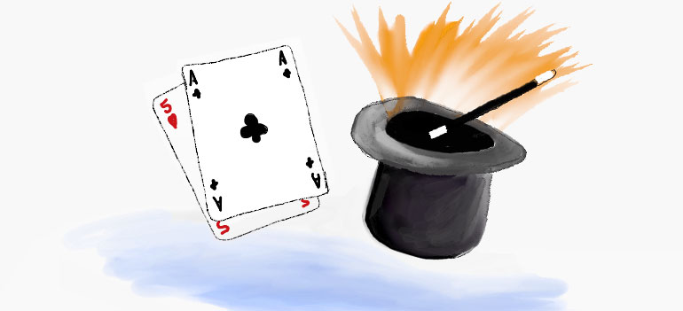
The Magician shuffles the deck of cards. "Pick a card, and place it back into the pack", he says. As the deck is reshuffled the chosen card's location is traced as it transcends through the pack, sliding over and under each card in turn.
"It’s the quickness of the hand that deceives the eye," the Magician says, as he flips the card over to reveal the Ace of Spades.
The playing card analogy works well when Designing Mobile Interactions.
Take half a dozen cards and place them on top of each other, now think of how touch gestures can be used to explore the cards, and how various techniques should be used to present information.
In the video below we use a number of playing cards to help visualise the importance of animation in Mobile App Design
Slide Over
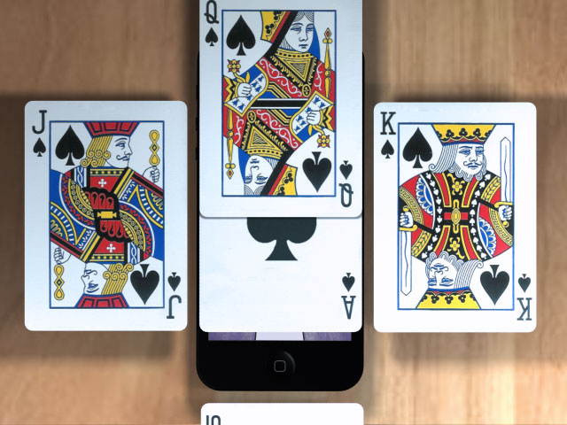
Method: Using either a tap or swipe gesture to slide a new screen above the one currently in view.
Use: Often used to display a modal dialogue, interrupting the users current flow.
Real example: Selecting the 'Sign in' link on Google's Mobile App will slide over a 'Sign In' screen - Slide Over Example
Slide left/right
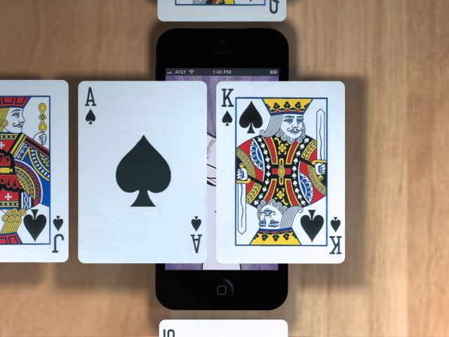
Method: Using the swipe gesture to slide left and right
Use: To navigate back and forth through a sequence of screens
- Continue reading
- Filed under:
- Mobile
- Design Patterns
- Mobile
- Mobile Interaction
Mobile Interaction Design for the subconscious mind
This article looks at how our perception of the physical world can be harnessed to design effective and successful Interaction patterns for Mobile touch screens.
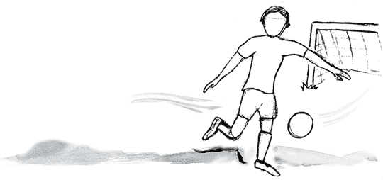
The football zooms across field at great speed. As you attempt to volley it goal-ward your conscious mind is rapidly deciding upon the best approach to score; as you watch the trajectory and predict the ball's location your unconscious is preparing your muscles for impact. GOAL! Like everything we do this entire process occurs at a conscious and subconscious level, as we interact with the physical world in which we live.
- Continue reading
- Filed under:
- Mobile
Tag cloud filter
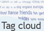 Tag clouds are great to visually indicate the popularity or frequency of a word. But as tag clouds increase in size so it takes more time to find the content tag you're looking for.
The efficiency of the tag cloud can be improved by applying colour ranges to match word frequency, as well as better use of text size. The article ("In search of the perfect Tag Cloud" looks at a number of sites with varying techniques.
Another way to quickly view tags by popularity is to filter them by a selected weight. Using the slider interface we can let the user quickly adjust the displayed tags.
Using a number of popular scripting libraries here is an example of our Tag Cloud filter.
- Continue reading
- Filed under:
- UI Design Patterns
- Interaction design
- JavaScript
- Prototype
- Slider
- Tag Cloud
- UI design
- Widgets
Introducing the Slider control
 The slider as a control interface can be found on a number of appliances within the home. Maybe more so within older analogue interfaces such as a television volume control or Hi-fi graphic equaliser.
All in all the sliders prime use is to control a range, where the position of the slider defines the control.
In this article we look at common uses of the 'Slider' within the home, the computer interface, web and Mobile UI.


