
This article looks at how our perception of the physical world can be harnessed to design effective and successful Interaction patterns for Mobile touch screens.
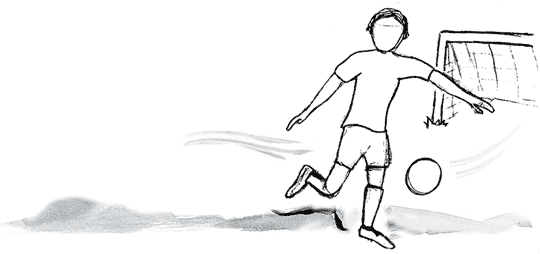
The football zooms across field at great speed. As you attempt to volley it goal-ward your conscious mind is rapidly deciding upon the best approach to score; as you watch the trajectory and predict the ball's location your unconscious is preparing your muscles for impact. GOAL! Like everything we do this entire process occurs at a conscious and subconscious level, as we interact with the physical world in which we live.
The digital world
When designing web-sites we rely so heavily on informing only our conscious mind, through numerous labels, signposts and waypoints. As we view a website our eyes dart across the screen consuming the visual stimulus, dwelling on bright and attractive visuals like moths to a light. We pause to concentrate as we read and digest the instructions, pondering whilst we analyse what we see and do.
As web designers we are compelled to fill the large screen with content, just as an artist would paint on a huge canvas. However on a web-page more often than not this creates unnecessary complexity and cognitive load, which simply means you'll lose your reader or prospective customer.
The Small Screen
When designing for the small screen we are forced to focus on utilising the real-estate available, reducing content and signposts for navigation. This doesn't mean removing navigation entirely but instead thinking of ways we can inform the subconscious mind without the need for labels and textual description. Many successful Mobile design patterns achieve this by emulating everyday patterns in the physical world though our understanding the Physics of motion.
Replicating the real world though the physics of motion
Elasticity
It was Newton who taught us about Inertia, where each action has an equal and opposite reaction. When you push or pull an object an equivalent force is applied. In Mobile design there are a number of affective patterns that use this understanding to help inform behaviour, namely the Pull-to-refresh, Recoil and Inertia Scroll.
Pull-to-refresh content
The user drags or pulls on a list in order to update the content of that list.
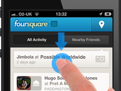
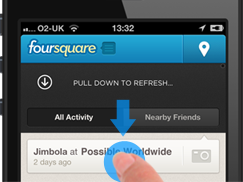


There is more to this pattern than pull down. It is the elasticity and motion that gives the user reassurance that something has happened, or about to happen. It is an affective pattern when observed in a usability test, and although it is learned behaviour, once discovered, users find themselves frequently using it to refresh content.
This pattern uses little real-estate and is useful in Mobile as loss of signal (internet connection) often requires users to refresh content to have an up-to-date view.
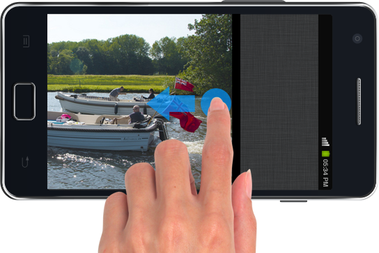
Recoil to denote the Begin or End point
This pattern is used to indicate the beginning and end of a sequence, it is often used when navigating an image gallery.
Once observed the user no-longer attempts to proceed, and instead subconsciously associates the last image (or first) viewed with this behaviour. I've tested the efficiency of this pattern on a number of occasions, it is so interesting to see how many times users attempt to continue when it is not used. Also when asking test candidates to recall their use of the gallery, very few recollect seeing the recoil or bounce effect. It is designing at this subconscious level that really makes a difference in interaction design.
This technique enforces directional awareness which is beneficial for users when building a mental model of the start and end location within a sequence.
Influencing gaze density through animation
Another effective pattern in mobile design is the use of animation to help guide and draw attention to a particular area of the screen.
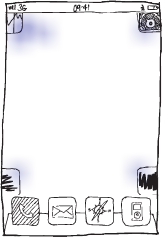
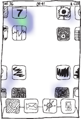
Icon Grid
The Grid, usually a set of evenly sized icons, this pattern serves the simple purpose of navigation (launching applications). Its optimum use is when restrained to only 4 x 4 icons, this is both for speed of use and location recollection.
In the western world it is common to read a grid of icons from top left, to bottom right, in a zig-zag motion. Although this process occurs at a fraction of a second it is still possible to increase recall and identification by applying a simple animation effect.
Apple have been using this technique since the first iPhone. The animation helps create a 'neutral' fixation point. This is where the eye line is drawn to the centre of the grid, momentarily stopping the viewer from 'reading' the grid. It is this process that causes the mind to view the grid in its entirety making it easier to locate the icon/application of choice.
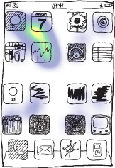
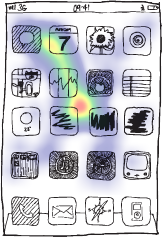
Noteworthy, this animation is most effective on a small symmetrical grid of no more than 4x4 icons. The results also vary when the user becomes familiar and learns the location of the application icons within the grid.
When using animation to aid and inform interaction it is paramount that the execution is perfect, resembling exactly what we would expect from the physical world. A momentary judder or 'unnatural' motion and what should be registered at the subconscious is exactly the opposite, and instead causes annoyance and frustration. It is for this reason that animations (transition effects) should only be used with devices that are capable of presenting the desired result.
Applying the correct interaction
It's so important not to blindly copy an approach but gain a full understanding of why and how it is used. I've seen a number of mobile manufacturers use mobile interaction patterns incorrectly, be it through how they've been applied or context of use (Pinch-to-zoom gesture being used to navigate content!).
Focus on designing interactions at a subconscious level, where success is measure by the fact that the user doesn't even notice they are there.
Related links
- Designing with motion - a collection of exemplar videos demonstrating the subtle use of animation and motion within interface design
- A New Mobile UX Design Material - exploration of how animation can be used to improve interaction and interface design
- Filed under:
- Mobile
- Posted by:
- James Griffin
- Dated:
- October 7, 2012
- Tweet