This is a continuation from my previous article - Mobile Interaction Design for the subconscious mind, where we looked at how Interaction Design and Animation can help form mental models for mobile touch-screen navigation.
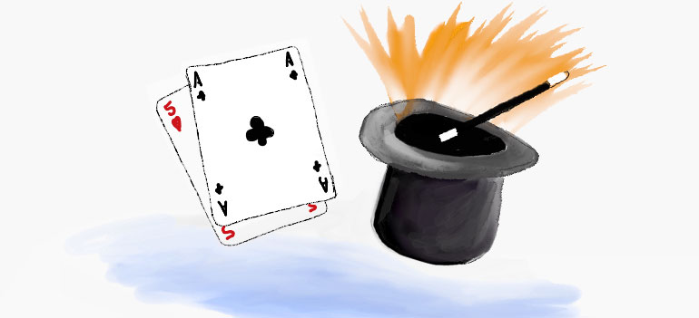
The Magician shuffles the deck of cards. "Pick a card, and place it back into the pack", he says. As the deck is reshuffled the chosen card's location is traced as it transcends through the pack, sliding over and under each card in turn.
"It’s the quickness of the hand that deceives the eye," the Magician says, as he flips the card over to reveal the Ace of Spades.
The playing card analogy works well when Designing Mobile Interactions.
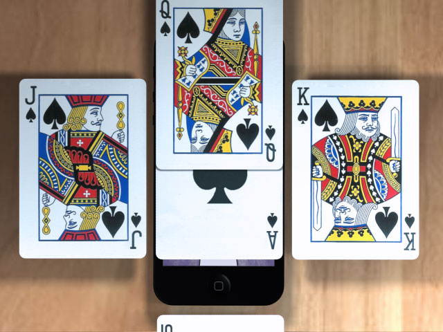
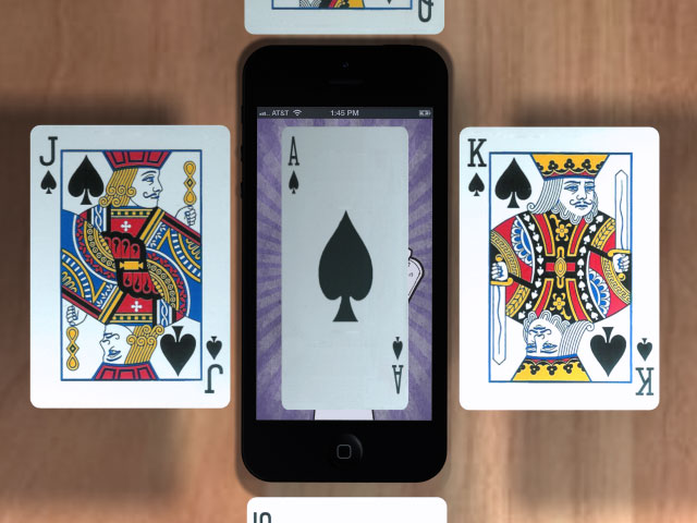
Take half a dozen cards and place them on top of each other, now think of how touch gestures can be used to explore the cards, and how various techniques should be used to present information.
In the video below we use a number of playing cards to help visualise the importance of animation in Mobile App Design
Slide Over

Method: Using either a tap or swipe gesture to slide a new screen above the one currently in view.
Use: Often used to display a modal dialogue, interrupting the users current flow.
Real example: Selecting the 'Sign in' link on Google's Mobile App will slide over a 'Sign In' screen - Slide Over Example
Slide left/right

Method: Using the swipe gesture to slide left and right
Use: To navigate back and forth through a sequence of screens
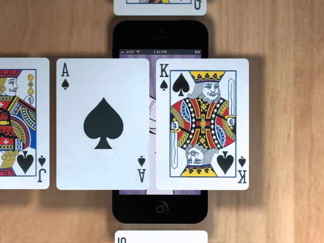
Reveal

Method: Partially slide the screen in focus left or right to reveal a new screen underneath.
Use: To reveal app navigation, or information that is in context to the overall application.
Real example: An obvious example is the Facebook app or Path app, however here is an example that I 'Pinned' on my Pinterest board a while back Reveal Example
Flip

Method: Tapping or double tapping on the current screen in view (side A) will flip the screen over to display the other side (side B).
Use: Side B presents a more detailed view of information than that on side A, or displays settings that can be adjusted, effecting the information displayed on Side A.
I hope the playing card analogy helps demonstrate the subtle differences in animation and how we can use these techniques to form the basis of our Mobile Application Design.
- Filed under:
- Mobile
- Design Patterns
- Mobile
- Mobile Interaction
- Posted by:
- James Griffin
- Dated:
- May 11, 2013
- Tweet
