I'm an advocate of Responsive Web Design, in the ever changing way we access the web it's a progressive step in designing for various screen sizes and resolutions. However of late I've seen trends that would suggest Responsive Web is the single and only solution for delivering a Mobile Strategy.
"Responsive Design is not a panacea. Rather a great step in the right direction" - Brad Frost.
There is also the notion that Mobile First is a costly and time consuming approach to adopt. This somewhat misses the point; maybe it's just a miss-interpretation of what Luke Wroblewski's Mobile First actually means! Mobile First shouldn't always involve starting from scratch for existing websites, nor is it merely about designing for small screens and adding more features for larger screens.
To the User Experience Designer 'Mobile First' is about designing experiences that meet user needs through the Context and Power of Mobile, harnessing the 'Smartphones' full capabilities and realising designs that breakaway from the limitations of the desktop computer.
When laying out a Mobile Strategy we have a wide range of methods and approaches in our mobile design kitbag:
- Native Apps
- Mobile Web Apps
- Hybrid-Apps
- Adaptive Web
- Responsive Web
The most important point is these shouldn't be seen as competing, but instead a Mobile Design Strategy can be made up of any number of approaches. The key to success however is that together they deliver a consistent and seamless experience for the end user.
Enough preamble; here's a 'real world' example of how a tailored mobile experience was realised through multiple approaches:
GetAheadOFTheGames for Mobile
Back in 2012 we were fortunate to work on the (BIMA nominated) GetAheadOfTheGames website, it was a website that helped travellers navigate and plan their daily journeys whilst the London 2012 Olympic Games were taking place. Nearing launch (and as expected) there was an influx of people accessing the site from their Smartphones. However there was no 'Mobile Friendly' version. In real-world situations like this there is little time to recreate a responsive website, or for that matter to design and develop a new mobile version. For a complex site like this it would involve, effort in design, development and an entire cycle of testing.
So the brief was to create a Mobile friendly version of the site ASAP. The most effective and efficient approach was to use a strategy that involved Responsive Web, Adaptive Mobile Templates and creating a Mobile Web App for the core user journey - public transport visualiser.
Responsive web
We looked at which areas of the site could be made responsive with minimum effort, as the site was CMS driven through templates we identified which templates could be re-designed and modified.

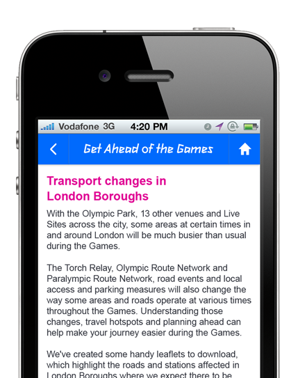
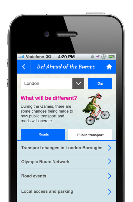
Adaptive Mobile Web Template
Taking a step back and looking at the site from a Mobile first approach we identified key mobile user journeys - optimising the Information Architecture, content and navigation.

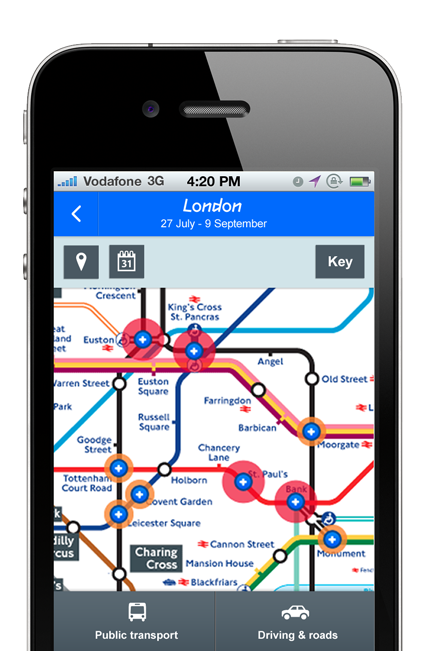
Mobile Web App
The core intent of the site was to help people identify possible congestion in the transport system due to the Olympic games. A redesign involved improving the design for touch screen, small screen layout and making use of the devices location. Also designing this as a self-contained mobile web app meant users could easily save it to their home screen, and view travel information without having to access/navigate the entire mobile web site.

No one size fits all
In conclusion there is currently 'no one size fits all' approach when considering a Mobile Design Strategy, but instead we should look at which approaches can be used together to design and deliver the optimal User Experience, considering cost and time.
As yet using Responsive Web alone we won't be able to design solutions that utilise the full extent the Mobile device has to offer, therefore in this real-world case study we took the existing site and used Adaptive, Responsive Web and a Mobile Web App approach to deliver a very useful and award nominated Mobile experience.
- Filed under:
- Mobile
- Adaptive Web
- mobile
- Mobile First
- Mobile Web
- Mobile Web Design
- Responsive Web Design
- Posted by:
- James Griffin
- Dated:
- January 3, 2014
- Tweet
